Showing posts with label OUGD504. Show all posts

Tuesday, 29 January 2013

REGGAE WEBSITE RESEARCH

After searching the internet for reggae sites I realised that pretty much all of them were really poorly designed and said nothing about reggae. The sites were very dull and boring and I feel personally were letting reggae music down. I am hoping to come up with something a bit more eye catching.


reggae.com - boring, colour scheme says nothing about reggae


Awfully designed website - garish and ugly


Little bit better but still does not represent reggae at all


http://www.bobmarley.com/ - this is allot better, much more natural
and relevant to reggae music. Nice colour scheme.


http://reggaetopsite.com/ - Not too bad, easy to navigate round. Could be better.


http://www.reggae-reggae.co.uk/ - I like the style of this, The colour scheme
is much more relevant, not half as tacky as the rest.


Tacky design with too much use of the rasta colours

Friday, 4 January 2013

Mutton Quad Visual Research

As I wanted to stay with the design studio feel I tried to find smart examples of branding
that uses Type well. I looked at letter press drawers too in order to get an idea of how
I can design mine for my range of products.


I also thought it would be nice to have large aspects of type on the exterior
of the building to entice people in as this definitely works to draw people in.


I thought this was a playful way to show the menu. Relevant to the Quad aspect of
mutton quad too.


 I particularly like this branding for the restaurant RUAA.
It looks vintage yet modern which I really like.
I like the rustic aspect of it. Its simple and stylish.
I really like the match box idea.


 I came across this branding for the Five & Dime restaurant. I liked the extent 
the designer went to in order to brand the restaurant. They have thought about
everything here, this helps to build a strong brand image.


I really like the laser cut beer mats this could be something to look at
they are easy to produce and also look really profesional.

Friday, 21 December 2012

ISTD - Mutton Quad - Past Responses

I came across some previous responses to the Mutton Quad brief that I found quite interesting. This has given me a better idea of the possible outcomes. I think I have bigger plans for my brief, Although we need to have some kind of printed response I have a fair few ideas that I would like to propose as I don't think I will be able to produce the products.

Full Stop
This guy chose to use punctuation as the basis for the theme and named the cafe/bistro 'Full Stop'. He applied punctuation to every aspect of the brand; from the posters to business cards and even using it as part of the way finding. 


mike-davey.co.uk/
This guy was the previous years winner. Its simple and smart.
I think he could of taken it allot further though.

cargocollective.com/lynnferrari

Samantha Hartill


I really like Samanthas concept for the brief. She served a different
style of food relavent to the eras of typography. Gothic roman etc...

Monday, 10 December 2012

Type Hate List

Comic Sans

“The AOL of fonts”
“Comic Sans is the dirt bastard of the design world.”
“An e-mail written in this font makes the sender seem ridiculous and out of touch.”
“I honestly think when I see Comic Sans that the person has a lower than average intelligence level.”
“It’s not that it’s a terrible font – it’s rather that it suits non-designers far better than those with a sense of the aesthetic would like.”

Arial

“So 1950′s”
“Arial is little more than a shameless impostor.’”
“Arial’s ubiquity is not due to its beauty. It’s actually rather homely.”
If you’re working in a medium where you’re not restricted to certain fonts, and you’re considering using Arial – don’t.”
“Arial is the poster child for the general typographic decline of the late twentieth and early twenty-first centuries.“

Times New Roman

“Very corny and boring”
“I just avoid when I can.”
“It’s simply bad, ugly and makes me nervous when I see it.”
“I cannot look at Times New Roman without automatically assuming that it is a placeholder font, waiting to be replaced by something appropriate for the text.“

Brush Script

“Brush Script is a useful tool for identifying morons. It is the typeface equivalent of the backwards worn baseball cap.”

Courier

“dull, unimaginative, plain”
“Courier always reminds me of sending a job to the printer and forgetting to include the fonts.”

Papyrus

“Papyrus: The official cool font for those who know nothing about typography.”
“I was an early user of Papyrus. I used it a lot for a long time. These days I hate it just like the rest of you.”
“When I visited my brother in South Dakota last year, nearly every billboard or pamphlet at the Rushmore Memorial Center used Comic Sans or Papyrus…. Ugh, barf.”
“I’m branding myself with this font. My website has to be in Papyrus! The text and everything!”

Lucinda Handwriting
Yet another handwriting font. For some reason people love the idea of making any writing look handwritten, blatantly disregarding the fact that the design shouldn’t have a personal feel. I’m always thinking who in the name of the Design-God thinks that a printed paper with this font is actually handwritten? Or worst, an email? For the sake of everything nice, if you want to use this type of font, trow away the computer and use a pen and a paper.


Tuesday, 4 December 2012

YCN Lego Architecture Research

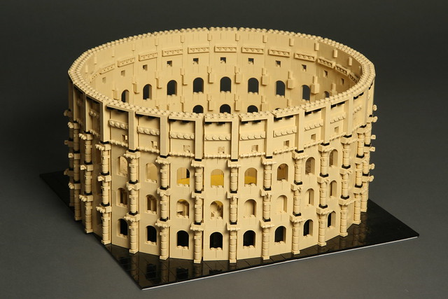
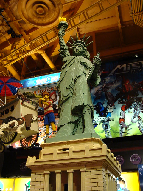
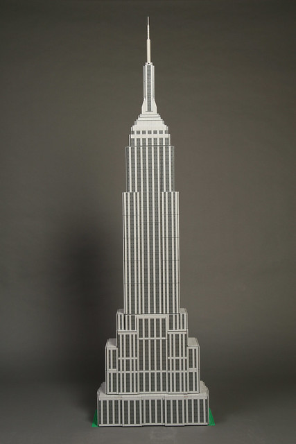
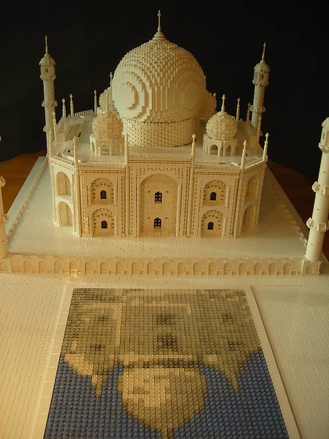
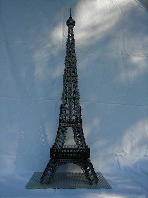
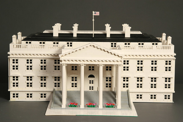
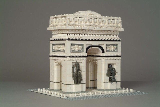
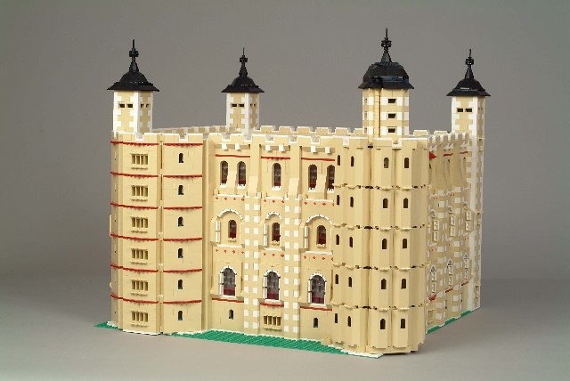
For my YCN lego brief I am proposing to do a stop motion video involving key aspects of architecture throughout the ages. I would like to build the buildings myself however I dont think I have enough lego myself. I have researched lego buildings that I think have been influential over the years. I want to convey the message that lego is the ORIGINAL building block, and by showing these buildings springing up through the ages It will hopefully give this message.

The Gherkin
Big Ben


Greek Colosseum 


Leaning Tower of Pisa


Chichen Itza
Angkor Wat 2
Angkorwat

Roman Coliseum
Another Colluseum

Lego Statue of Liberty
Statue of Liberty

Empire State Building

Taj Mahal
Taj Mahal

Eiffel Tower
Eifell Tower

White House 02
The White House

Arc de Triomphe
Arc de Triomphe

Tower of London
Tower of London

frank_lloyd_wright_lego_guggenheim
Guggenheim Museum

I found most of these from : https://www.flickr.com/photos/budgetplaces/galleries/72157624664411514/


Friday, 23 November 2012

BOOK BINDING RESEARCH


In order to to get an idea of how I could bind my book I researched online the different methods. I found this usual list on Emily Duong's blog which I found helpful. After looking through the methods I think I am going to perfect bind my book. I will glue the edges then hopefully Put screws through it to finish it off. I am hoping the emboss the front cover.
Commercially Available Techniques
Saddle Stitched/Side Stitched
Spiral, Plastic Comb, Wire-O
Thermal Tape
Perfect
Case
Custom Techniques
Japanese Stab
Saddle Sewn
Side Sewn
Screw Post
Coptic
Long Stitch
Secret Belgian
Commercially Available Techniques
The following are book binding techniques you can get from printers as a standard service. All of these can also be made by hand.

Saddle Stitched/Side Stitched

Example of saddle stitching
Method: Spreads folded and staples are applied on the spine from the cover to the center spread to hold everything in place.
Common uses: notebooks, programs, office presentations
Pros: Very cheap; staples are the only materials needed;
Cons: May make the product look cheap, depending on the design;

Spiral, Plastic Comb and Wire-O

Example of spiral bound book From Flickr user SewPixie
Spiral notebook photo from Flickr user SewPixie.
Example of plastic comb binding from Flickr user Abecedarian Gallery
Plastic comb notebooks photo from Flickr user Abecedarian Gallery.
Example of Wire-o binding From Flickr user incurable_hippie
Wire-o binding from Flickr user incurable_hippie.
Method: Punched holes by the spine with a plastic or wire coil or comb looping through all the pages.
Common uses: notebooks, office presentations, planners, sketchbooks
Pros: Ability to lay spreads flat; ability to fold back the book without damaging the pages.
Cons: May make the product look cheap, depending on the design; coils are not recyclable and a hassle to remove;
Resources GBC – one of the largest retailers for spiral, plastic comb and wire-o binding supplies

Thermal Tape

Example of thermal tape binding From Mimeo
Photo from Mimeo.
Method: Creates a book by placing a strip, with one side adhesive, onto the spine and over the cover. Then the book is inserted spine side into a machine to heat the adhesive and add pressure to seal the edges.  
Common uses: notebooks, notepads, office documents, manuals 
Pros: Sturdy spine, very similar to perfect binding.
Cons: Exposed binding – can easily pick at the strip; getting text or graphics on the spine will be a custom job. 
Resources: Here’s a demo/sale video from Accubind, a popular supplier of thermal tape binding machines. Unibind and velo is also similar. Mimeo also offers this service.

Perfect

Examples of perfect binding - magazines and paperback novels - Left: from Flickr user bravenewtraveler - Right: from Flickr user dinoboy
Left photo: from Flickr user bravenewtraveler; Right: from Flickr user dinoboy;
Method: Pages are glued on the spine, which needs to have a rough surface so the glue can stick easily, into a cover that wraps around the back, spine and front.
Common uses: paper back novels, magazines, catalogs
Pros: Allows the spine and pages to be flexible; easily mass produced and easy to DIY;
Cons: Does not allow for hardcover, so more susceptible to wear and tear’
Resources: Science Channel video on a perfect binding machine.

Case

Example of a case bound book from Flickr user natalee929
Photo from Flickr user natalee929;
Diagram & Example of Case Binding
Left photo: diagram from Unique Bindery; Right: from Flickr user moirabot;
Method: Pages are divided into signatures then sewn together and adhered into a hard casing, traditionally cloth covered cardboard.
Common uses: textbooks, hardcover books, bibles
Pros: Hardcover creates a rigid product and protects the sheets inside better;
Cons: Time consuming to DIY; much more expensive than perfect binding;
Resources: Buy a case bound kit at Hollander’s (from $12 to $55); a 3 minute introduction  video from the Kolbus plant; Tutorials from Angela Sutton, Douglas W. Jones at Univeristy of Iowa and Garry Harrison at Indiana University.

Custom Techniques
The following techniques are more of a hand crafted art form. They can be mass produced by a printing company, however, the cost per unit is much higher than the techniques described above. Please note these are not the only custom techniques, there’s no limit to how a book can be bound!

Japanese Stab

Example of Japanese stab binding from Flickr user lindr
Image from Flickr user lindr;
Examples of Japanese stab binding - left from Flickr user henna lion - right from Flickr user nsfmc
Left image from Flickr user henna lion; Right from Flickr user nsfmc;
Method: Binds loose pages using exposed thread that wraps around the spine and on the top and bottom of the book. 
Resources: Buy a kit with all the materials needed at Dick Blick (starting at $20.89); APDF tutorial on this method from Bley Hack (via Vintage Indie); 9-minute video tutorialfrom CuriousDoodles;

Saddle Sewn

Moleskine cahier saddle sewn books, from Flickr user amy in holland
Image from Flickr user amy in holland;
Method: Collated pages are folded in half and sewn in the middle through the cover to hold everything in place.
Resources: Tutorial from eHow; a very blunt tutorial from Lingualinks;

Side Sewn

Example of side sewn books Left: from Flickr user sepme; Right: personal
Left image: from Instructables user sepme; Right: personal photograph
Method: Loose pages and the cover (wrap or loose) are held together by sewing through all the pages from cover to cover, a certain distance from the spine.
Resources: Tutorial by sepme on Instructables;

Post Binding

Examples of screw post binding Left: from Flickr user Terry Tyson; Right: from Sam Flax
Left: from Flickr user Terry Tyson; Right: from Sam Flax;
Method: Holds in loose pages using screws that go through the cover and all the pages.
Common Uses: Portfolios, photo albums
Pros: Can easily change pages inside;
Cons: Hardware heavy – exposed metal;
Resources: DIY tutorial on Instructables by pupuccachu; Screw post binders at Sam Flax;

Coptic

Example of coptic binding from Flickr user moirabot
Image from Flickr user moirabot;
Example of coptic binding from Flickr user andymangold
Image from Flickr user andymangold;
Method: Using signatures, these binding method has an exposed spine and threading that creates braids along the spine.
Pros: Allows the book to lay almost flat.
Resources: DIY Kit from etsy user WriteOwl; Video tutorial using boards & only two signatures from jaescala; Tutorial from Linda at Torta Gialla with lots of photos;

Long Stitch

Example of Longstitch binding from Flickr user ashe-villain
Image from Flickr user ashe-villain;
Example of long stitch binding from Flickr user Jane Stockton
Image from Flickr user Jane Stockton;
Method: Also known as limp binding, signatures are individually bound to the spine, allowing for the creator to make unique patterns on the spine.
Resources: Another great photo heavy tutorial from Ling at Torta Gialla; Video tutorial on assembling the final product by Majhada Crafts;

Secret Belgian

Example of secret belgian binding From Flickr user Dennis Yuen
Image from Flickr user Dennis Yuen;
Method: No longer a secret (haha), this binding uses exposed threads, wrapping around the spine, covers and through the signatures inside.
Pro: Because signatures are used rather than flat pages, it allows the book to lay flat;
Resources: DIY Tutorial from Sam;