Thursday, 16 January 2014

Final Prints

Exhibition Space


Black and White Versions


Printing on the coated lino stock created a shiny dappled texture


Here you can see the cracks in the type. This has really emphasized the characteristics of old type.


Shiny Finish


Printed on Newsprint : absorbed lots of ink


Dappled Effect - Coated Lino Stock


What Went Wrong 


There was often smudges from taking the paper of the chase.


Here you can see the embossing on the back of the paper - too much pressure


Over Inking on 'IS THE'


Smudging above core

Tuesday, 14 January 2014

Final Posters : Letterpress Production

Colour Prints

Overall I was really happy with how my prints turned out. It was a hectic week of work but the end result has certainly payed off. I learned allot about typesetting during my week printing, it has taught me the physical aspects of designing, working with various typographic elements. The physical nature of the work was allot more enjoyable than been stuck in front of a computer all day. It was also a different way of designing which was much more structured as the process limits how you can design. I found that the grid was really helpful when designing for letterpress as this ensures everything is neat and organised with correct spacing. I was slightly limited when creating my posters as there was a shortage of letters, I had to choose my words appropriately in order to complete each of the statements. Originally I had planned to use just one typeface for the posters, however the lack of type forced me to experiment with various fonts which has actually worked allot better than I expected. I think that using a combination of typefaces and weight fonts has helped to create striking interesting posters which say something about the relevance of letterpress to 21st century graphic designers.

Once I had completed all my prints I scanned them in as you can see here:


One of the hardest things I found when printing, was laying the paper down in the right spot, because you have to place the paper on the set type it is difficult to arrange it centrally and accurately so as you can some of the posters are slightly off, which slightly lets them down but this is just the nature of the business. I think printing on coloured stock has really brought the posters to life, the series of prints are bold and eye catching and illustrate the tactile qualities of letterpress.

Black and White Prints

I also printed loads of black and white versions experimenting with different stock, I printed on cartridge paper, coated stock and some Lino print paper which created a nice effect when the inks printed.


One of the issues I had when printing was getting the pressure right on the press. As you can see on the right hand side there is a crease between 'Used by'. This could be corrected by taking away padding from the press, I was trying to leave an impression as this is the thing to do in 21st century however it wasn't always easy to leave an impression without creasing aspects of the print. On the left hand side you can see slight smudge marks around the lettering, this is because it is extremely difficult to lift the paper from the type without moving it slightly. I had lots of trouble with this but it all adds to the letterpress aesthetic.


Friday, 10 January 2014

Letterpress Diary Day 3: Friday 10th January

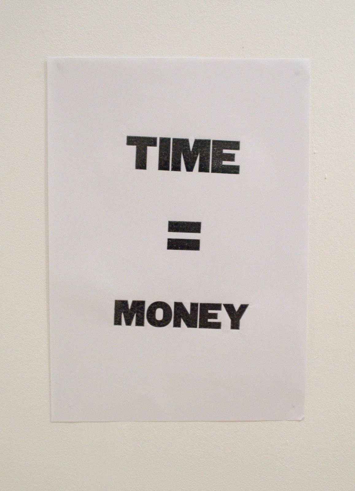
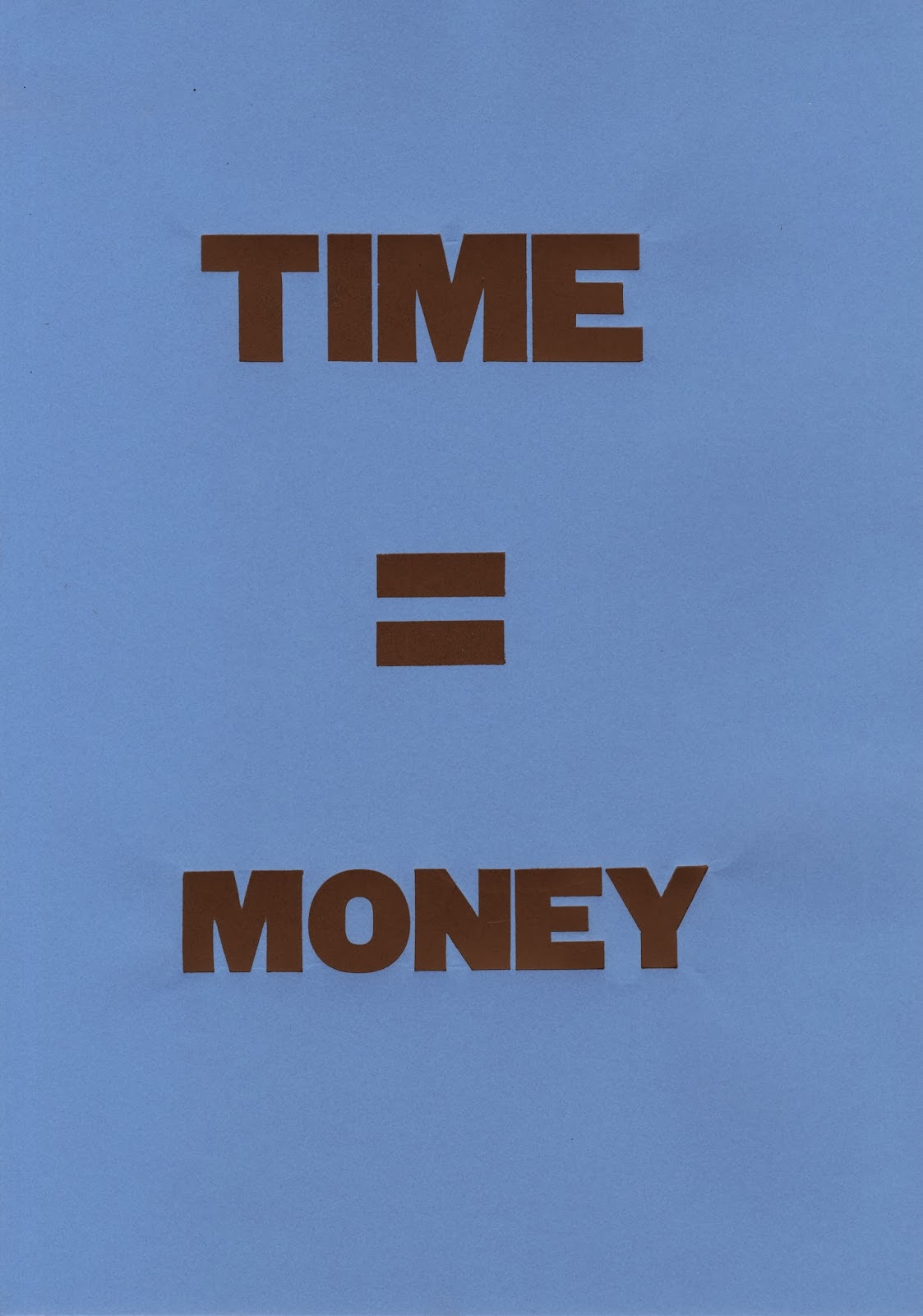
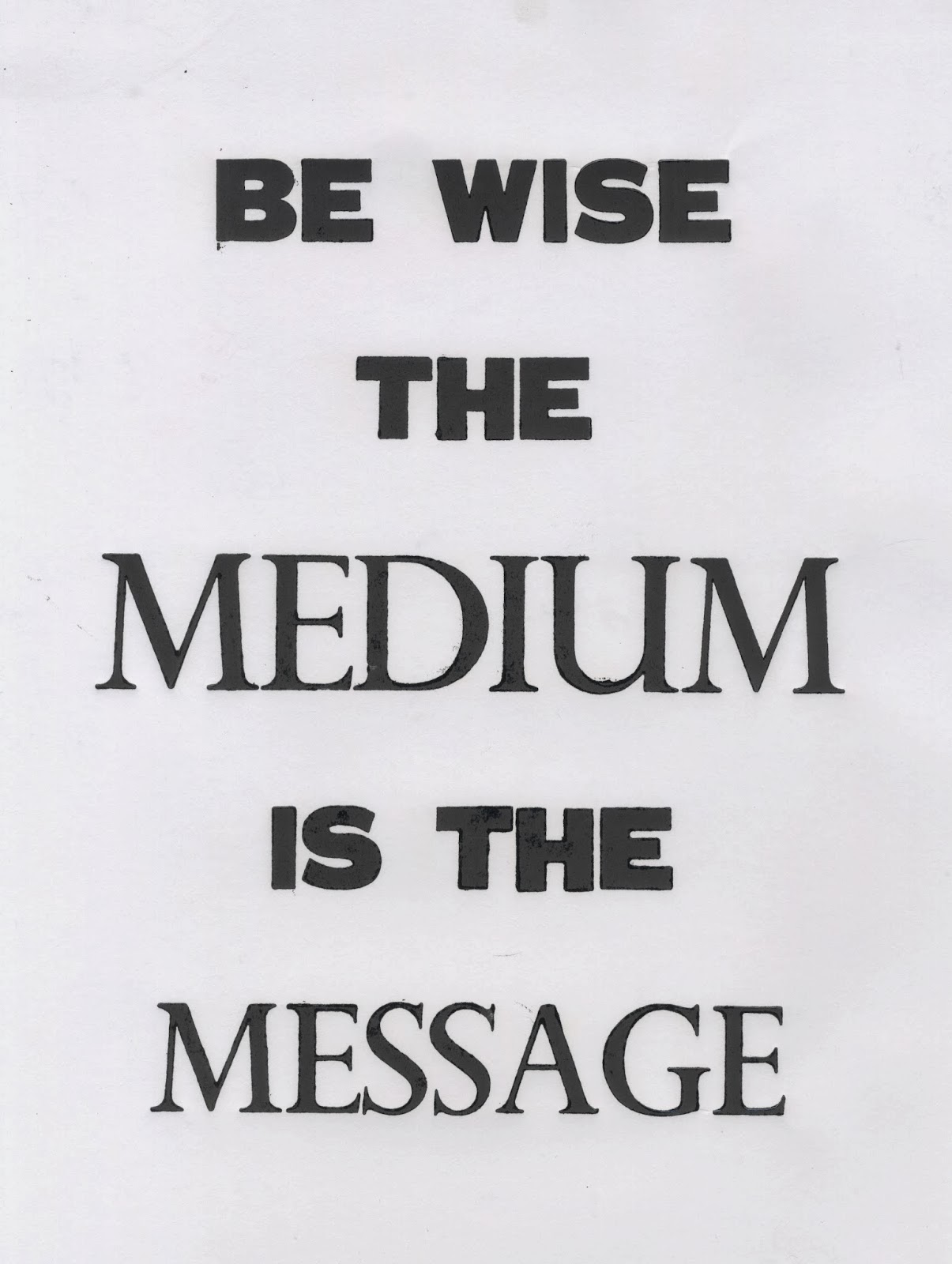
 The Medium is the Message


Today went really well in the print room. I managed to get 3 posters done again without having too many problems. This poster is taken from McLuhan's theory that the medium is the message. I decided to use a serif font to emphasize the 2 key words in the statement.


Used by few but never Forgotten


This poster took barely any time to set at all and I had no problems printing this design.

How Relevant is Letterpress to Graphic Design Today


The final poster I produced was basically my dissertation title. I managed to print one copy before realizing I had spelt letterpress wrong, because of this I had to reconsider my typeface as this version would not fit in the chase. I decided to just use one typeface instead for this poster. I found that my designs were quite limited due to the lack of type available.


Here you can see the final printed version. I am really happy with the quality of the print and the composition. I feel that learning to set type has really benefited my practice. I have learned the basics of typography and the physicality of designing with words.

Overview

I am really happy with how this week has gone in the print room. It took a day to get properly into the swing of things but by the end of the week I had found my rhythm and was printing much faster as time went on. I also found it allot easier to set the type and figured out ways to make it more manageable. This is something that became second nature the more I did it. At first I found it difficult working backwards but eventually managed quite well. I found that working with block lettering was really helpful, I learned how to use type properly and found that working with a grid structure made helped with my composition.

It was interesting to see how the ink set on different stocks. The lino print paper made the ink sit on top of the paper creating a dappled shiny effect and in some cases emphasized the cracks and imperfections. The cartridge paper adsorbed quite a bit of the ink as did the coloured stock which resulted in some really bold prints.

Thursday, 9 January 2014

Letterpress Diary Day 2 : Thursday 9th

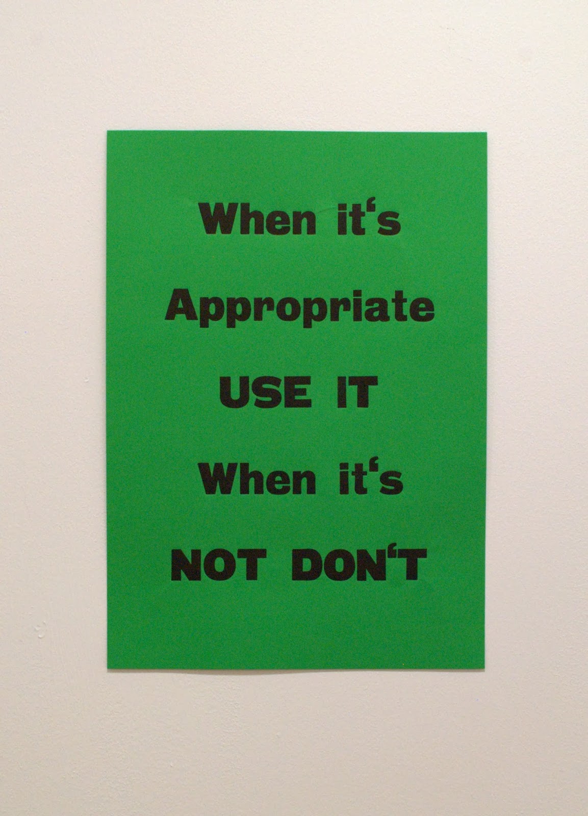
 When its Appropriate Use it when its not Don't


Today went allot more smoothly than yesterday. I was straight away back into my rhythm and managed to set this poster fairly quickly. This is a statement that Martyn from The Beautiful Meme said in the interview which I think really sums up letterpress for graphic designers. A good designer chooses the right medium for the message. This was fairly easy to set apart from a few loose blocks which I managed to rectify.


I only used one typeface for this poster but experimented with upper and lower case type. I am really happy with how this has turned out. The composition works well and the statement is bold and appropriate.

Unique Tactile Exciting


For this poster I wanted to use some of the random italic font to highlight the unique tactile qualities of letterpress as much of this type looks worn and is allot different to any of the other type I had been working with. Because this type was italicized I had to use tape in order to position the blocks together. This stopped the lettering from moving about in the chase. One problem I did have with this type was finding the write letter forms. The box of type was so mixed up it took around 40 minutes to find the correct letters for the job.


Once I had managed to tape up the italicized font and lock it in place the rest of the lettering was fairly easy to assemble. I wanted to showcase how different the lettering can print with letterpress so I used 3 different typefaces to produce this poster. I am really happy with the print, I feel like the aesthetics and texture of the poster represents the statement.


Here you can see the range of stocks I used. I printed each of the posters on some colour stock as well in the style of Anthony Burrills posters which really bring the statements to life. They look bold and eye catching and highlight the characteristics of letterpress.
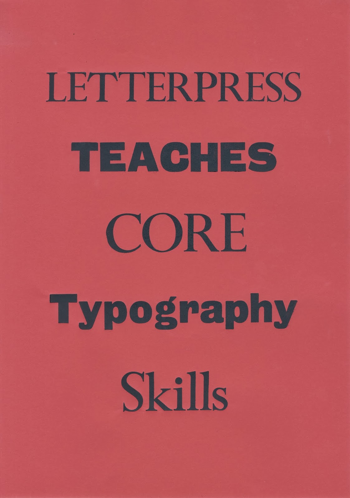
Letterpress Teaches Core Typography Skills


I had trouble finding the right letters to produce this poster. I wanted to use the serif typeface for the 'letterpress' however I could only find a b instead of a p. I decided to stick with the grotesque typeface instead and decided on a different composition.


Here you can see the type set in the chase. This piece took quite a while to set as there were so many loose letters. I had to pack the chase loads in order for it all to lock in.


Once I had finally set the type I realized that I had put the 'C' in backwards in the word 'CORE'. This was pretty frustrating as it had taken so long to lock in place but luckily no other letters fell out once I had corrected it.

Overview

Today went a lot smoother than yesterday, I managed to get 3 posters printed in the same time as it had taken me to do 2 posters the previous day. I definitely found my rhythm today and found setting type allot easier, it also helped that I had plenty of bits of card and paper pre cut from yesterday. I also found it easier when positioning my paper on the chase, producing much straighter prints.

Apart from positioning letters the wrong way I didn't really have any major problems. Luckily I caught that mistake before I had started printing. I am really pleased with my progress so far and have already exceeded my expectations.