Thursday 15 December 2011

Lecture 6 - Film Theory -Italian Vernacular Cinema

1970's: 'film is not the art of scholars, but of illiterates' - Werner Herzog

  • Vernaculate in the sense that the Films made for the modority of people, partially the working classes if the italian city.
  • Fellini is taken very seriously as an Auteur and comments of the superficiality of middle class existence. His films are associated with style and sophistication and seen as worthy of critical appraisal.
  • Can be interpreted in different ways, this means that the modernity of films rant made for the intellectual its made for normal people
  • Film its self isn't about literacy or dialogue, its more about visuality and the specucal.
  • The vernacular cinema is the opposite to the Auteur theory from the previous lecture involving the theory and method of Hitchcock. looking at other factors that construct a film.
  • Involves allot more than regular views of cinema ; audiences, historical and social contexts.
prima visioneand secondavisione– cinemas thatwatchattracted a middle class sophisticated audience usually in major cities, audience selected a film to

terzavisione– less populated areas, cheaper tickets, audience went to cinema based on habit rather than selecting a film. Films were more formulaic and popular films

• Wagstaff notes that the terza visione audience was more like a television audience, going to the cinema after dinner, without any particular film in mind, arriving without respect to start time, and often using the outing as a social event, to talk during the screening, meet with friends, etc.
•(in some churches mass was conducted in a similar way)
Filone/Genre 
Instead of using the word genre the italians would use the word filone. 
Filone is a very similar term for genre but not quite. 
Based on the idea of geology- layers of veins within a larger layer. 
Speggetti wastern is an offshoot an vein within the larger starter 
Filone is more respectful it means in the tradition of, by emulating someone else you are been
respectful 
Examples of Filone are, Giallo – based on detective novels, Spaghetti Westerns, Mondo/Cannibal
film, Poliziottesco – police procedural. 
 Giallo is interesting as it mixes the detective novel with the sequences of the spectacular horror 
Typicall sequence of a spaghetti western is the film "  The Good, the Bad and the Ugly 1966 directed
by Sergio Leone. 
•Use of sound
•Use of Music
•Lack of dialogue
•Use of eye line and cutting
•Differences in scale
•Use of camera to tell a story
•Fragmentation of body
•Catholic references
 
Giallo
  
Giallo is italian for 'Yellow' and stems from the series of cheap paperback crime novels and mysteries novels the 
films are based on.  
Literature for the working classes  
Giallo Directors making films for mass audiences are: Mario Bava, Dario Argento and Lucio Fulci.   
generic 
stylish and expressionistic.   
challenge your good taste, there is a lot of gore and sex appealing to the audience.   
exploration movies  
Theses film were cheaply made that sometimes just went out as a title without a script.

Subjective POV
•Killer-cam
•Eye line shot – killer/victim/amateur detective
•Set pieces
•Art and cultural references
•Semiotics
•Ambivalence towards modernity, religion and superstition
•The Fall
  
Dubbing and Heightened Sound
•Like Leone,  Argento shot  his films without sound then added dialogue and sound effects later.
•This allows the film to be dubbed using many languages
•Often sold to America and Britain as ‘B’ movies – drive in movies


Product placement Evoking a sophisticated lifestyle within the films
Signifies lifestyle associated with the product
 Freudian Psychology 
•Many giallo  demand to be read from psychoanalytical point of view 
•Based on false memory 
•Childhood trauma 
•Fetish  (eyes, gloves, cut-throat raiser) 
•Solution of mystery lies in art 
Works of art in Giallo are often subverted and associated with the madness of the psychopath and regularly provide a conduit into the past and into the mind of the antagonist 
 Are exploiation films worthy of examination?
•Innovation and auteurship
•Necessity is the mother of invention
•Technical mastery
•Visual critique based on spectacle rather than literary critique based on narrative
•Tells us about different kinds of audiences and modes of viewing
•Tells us about the context in which theses films were made
•Challenge to Hollywood’s continuity cinema
  Is vernacular film dead? 
•Multiplexes aimed at people with cars
•Going to cinema is a special event
•Cinema tickets are expensive
•DVD and digital formats mean audiences watch in own home or on the move
•Social aspects of film-watching done on line rather than at the cinema

Monday 12 December 2011

Fred Task

This morning we have been looking at the design process, after looking through my research for the module so far I identified 5 themes and 5 specific subjects and put them into 2 columns. From the list I then created another but this time I put the 10 points down the middle of the page and worked out what would be the theme and subject for each point.


 Then I we were given the task of finding:
  • 10 words related to the subject/theme
  • 10 facts about the subject/theme
  • 10 objects related to the subject/theme
  • 10 people associated with the subject/theme 

Dress Codes

Facts
  1.  In Iran, men are not allowed to wear shorts.
  2. Many regions of the world, national costumes and styles in clothing and ornament declare membership in a certain village, caste, religion.
  3. Chinese people are very conservative when it comes to clothing. Most of them don't wear swimsuits on the beach. During traditional festival, the Chinese like to dress up before joining the festival. Middle aged women wear cheong-sam which is a skirt; men usually dress up in a suit and tie.
  4. In Iran there are rules for outsiders; color, head, body, and legs/feet must be covered.
  5. In Mexico, what clothes you wear is important. When going out to a formal dinner men should wear a shirt and tie, and women should always wear a formal dress; however, this might be only valid for more old and conservative generations. For breakfast and lunch semi-casual clothing would be fine.
  6. A Sikh or Muslim man may display his religious affiliation by wearing a turban and other traditional clothing. Many Muslim women wear head or body covering (see Sartorial hijab, hijab, burqa or niqab, chador and abaya) that proclaims their status as respectable women and as considered a means for covering the Awrah. A Jewish man may indicate his observance of Judaism by wearing a yarmulke.
  7. In Tonga, it is illegal for men to appear in public without a shirt.
  8. In New Guinea and Vanuatu, there are areas where it is customary for the men to wear nothing but penis sheaths in public - this is uncommon in more developed areas. Women wear string skirts. In remote areas of Bali, women may go topless. In America there are nude beaches and in China women have started wearing only the top of their traditional dresses baring their legs entirely to copy west .
  9. In the United States, a few businesses or restaurants display dress code signs requiring shoes and shirts, claiming to be there on account of a health code, although no such health codes exist.
  10. The Chinese feel that wearing an indecent dress will take away your dignity. The younger generation would wear semi formal clothing to fit in the banquet.
Objects
  1. Trousers
  2. Shirt
  3. Tie
  4. Dress
  5. Skirt
  6. Shoes
  7. Socks
  8. Hats
  9. Shorts
  10. T-Shirt
People
  1. The Military
  2. Police
  3. Ambulance Service
  4. School Children
  5. Business Men
  6. Fire Service
  7. Athletes
  8. Super Market Staff
  9. Teachers
  10. Bouncers
Words
  1. Buisness Casual
  2. Smart Casual
  3. Uniform
  4. Casual
  5. Smart
  6. Formal
  7. Informal
  8. Dinner Suit
  9. Semi-Casual
  10.  Image

Smart Casual

Facts
  1.  Smart casual (as distinct from business casual) is a loosely defined dress code, casual, yet "smart"
  2. It has been suggested that smart casual for men consists of dress trousers—this includes chinos—a long-sleeve dress shirt (tie optional), leather loafers or dressy slip-ons, dress socks, a belt, and, if appropriate, a sport coat or blazer.
  3. An alternative form, the Burnt Hills smart casual, allows for crisp blue jeans to be worn (no holes or places where you stepped on the heel too much). A tie is usually introduced to the ensemble, and the wearing of a jacket is stressed.
  4. For women, it consists of slacks or a skirt (long or short), a blouse or turtleneck, a fashionable belt, a jacket, a vest, or a sweater coordinated to the outfit, hosiery or socks with boots, flats (leather, suede, or fabric) or mid-heel shoes. Women may also wear jewelry, such as earrings, that complement their overall outfit.
  5. Smart Casual, the debut album from Kids in Glass Houses, recorded during late 2007 at Long Wave Studios with Romesh Dodangoda.
  6. You can get a smart casual outfit from about £15

Objects
  1. Blazer
  2. Chinos
  3. Dress Trousers
  4. Skirt
  5. Shoes
  6. Tie
  7. Shirt
  8. Heels
  9. Slacks
  10. Blouse
People
  1. Graphic Designers
  2. Uni Lecturers
  3. Teachers
  4. Shop Keepers
  5. Retail Staff
  6. Sales Assistants

Words
  1. Business Casual
  2. Smart Casual
  3. Uniform
  4. Casual
  5. Smart
  6. Formal
  7. Informal
  8. Semi-Casual
  9.  Image
  10. Relaxed
Info Graphics

Facts
  1. Information graphics or infographics are graphic visual representations of information, data or knowledge.
  2. Info graphics present complex information quickly and clearly, such as in signs, maps, journalism, technical writing, and education. With an information graphic, computer scientists, mathematicians, and statisticians develop and communicate concepts using a single symbol to process information.
  3. In newspapers, info graphics are commonly used to show the weather, as well as maps and site plans for newsworthy events, and graphs for statistical data
  4. Although they are used heavily in children's books, they are also common in scientific literature, where they illustrate physical systems, especially ones that cannot be photographed (such as cutaway diagrams, astronomical diagrams, and images of microscopic or sub-microscopic systems).
  5. Modern maps, especially route maps for transit systems, use infographic techniques to integrate a variety of information, such as the conceptual layout of the transit network, transfer points, and local landmarks.
  6. In prehistory, early humans created the first information graphics: cave paintings and later maps. 
  7. Map-making began several millennia before writing, and the map at Çatalhöyük dates from around 7500 BCE. Later icons were used to keep records of cattle and stock. The Indians of Mesoamerica used imagery to depict the journeys of past generations. Illegible on their own, they served as a supportive element to memory and storytelling.
  8. In 1626 Christopher Scheiner published the Rosa Ursina sive Sol which used a variety of graphics to reveal his astronomical research on the sun. He used a series of images to explain the rotation of the sun over time (by tracking sunspots).
  9. In 1786, William Playfair published the first data graphs in his book The Commercial and Political Atlas. The book is filled with statistical graphs, bar charts, line graphs and histograms, that represent the economy of 18th century England.
  10. In 1857, English nurse Florence Nightingale used information graphics persuading Queen Victoria to improve conditions in military hospitals, principally the Coxcomb chart, a combination of stacked bar and pie charts, depicting the number and causes of deaths during each month of the Crimean War.

Objects
  1. Booklets
  2. Posters
  3. Computers
  4. Leaflets
  5. Bill Boards
  6. Packaging
  7. Maps
  8. Signs
  9. Banners
  10. Flags 
People
  1. Jacques Bertin
  2. William S. Cleveland 
  3. Paul Lewi
  4. Thomas L. Hankins
  5. Robert L. Harris 
  6. Eric K. Meyer
  7. Edward R. Tufte
  8. John Wilder Tukey
  9. Ben Shneiderman
  10. Edward Tufte  
Words
  1. Information
  2. Knowledge
  3. Data
  4. Instructions
  5. Education
  6. Statistics
  7. Mapping
  8. Visual Communication
  9.  Diagrams
  10. Symbols
Clothing Storage

Words
  1. Organisation
  2. Preservation
  3. Tidy
  4. Hanging
  5. Folding
  6. Fresh
  7. Neat
  8. Drying
Objects
  1. Wardrobe 
  2. Draws
  3. Cupboard
  4. Coat Hangers
  5. Shelves
  6. Trousers
  7. Shirts
  8. Coats
  9. T-shirts
  10. Racks
Clothing Costs

 Words
  1. Money
  2. Delivery
  3. Cost to Make
  4. Budget
  5. Shopping
  6. Materials
  7. Where it was made
  8. Production
  9. Make?
  10. Location
Objects
  1. Wardrobe
  2. Dress
  3. Skirt
  4. Blouse
  5. Money
  6. Till
  7. Trousers
  8. Shirts
  9. T-shirts
  10. Shirts

Booklet / Tag Design

Words
  1. Branding
  2. Price
  3. Company
  4. Design
  5. Image
  6. Materials
  7. Ethics
  8. Net
  9. Cost
  10. Colour
Objects
  1. Tags
  2. Booklets
  3. Nets
  4. Card
  5. Plastic
  6. Metal
  7. Fabric
  8. Price Tag
  9. Leaflets
  10. Poster
Boosting moral in the work place

Facts
 
Casual wear Business wear Human Resources Survey

  1. 90% of all US companies have casual day of some kind
  2. 1/3 of all companies allow casual clothing every day
  3. More than 40% of all companies have expanded their casual dress options in the last three years
  4. 87% - improves morale
  5. 81% - perceived by employees as a benefit
  6. 51% - employees save money because of casual dress
  7. 47% - improves productivity 
  8. Given the chance, 96% of employees take advantage 
  9. 57% - Better camaraderie with managers & co-workers
  10. 51% - Do best work when casually dressed
  11. 43% - Boss is more approachable
 Words
  1. Happiness
  2. Productivity
  3. Company
  4. Work Ethics
  5. Sadness
  6. Friendly
  7. Relationship
  8. Casual
  9. Relaxed
  10. Work
Objects
  1.  

Fabric Care

Facts
  1. Polyester, the most commonly used manufactured fiber, is made from petroleum in an energy-intensive process that emits volatile organic compounds (VOCs) and acid gases into the air. The process also uses a large amount of water for cooling.
  2. The manufacturing of nylon emits nitrous oxide, a greenhouse gas with a carbon footprint 310 times that of carbon dioxide. 
  3. Rayon, derived from wood pulp, often relies on clearing old growth forests to make way for water-hungry eucalyptus trees, from which the fiber is derived.
  4. Cotton, found in most clothing, is the most pesticide-dependent crop in the world. It takes one-third of a pound of pesticides to make one t-shirt.

Ironing Techniques

Extend the Life of Clothing

Friday 9 December 2011

Lecture 5 - Film Theory - New Wave Cinema

1950's -60's
  • Period of many new waves
  • Britain
  • French 
Group of French Film Makers
  • The leading french film makers at the time .
    jean- Luc goddard
    Francois Truffaut
    claude chabrol
    Jacques Rivette
    Eric Rohmer
  • All of these film makers shared a back ground in film theory  were once film  crtitics
Italy
  • Rederico fellini
  • Michaelangelo Antonioni
  • Pier paolo Pasolini
  • New wave was a discovary of american genre films, based on cinematic quality rather than literary value.
    Focusing on the importance of personal exprestion of the director involving spontaneity and digression.
  • The new wave wanted certain reactions from it’s audience, stress, the experience of free choice, an absence of rational understanding of  the universe, The sense of absurdity in human life  
Reacting against french film of 1940's (cinema du papa)
  • - Against films shot in a studio
  • - Against films that were set in the past
  • - Against films that were contrived and overdramatised
  • - Against films that used trickery and special effects
  • - Against la tradition de qualite
 
Visual Themes Found in New wave
  • Used light weight hand held cameras
  • Light weight sound and lighting equipment.
  • Faster film stocks, less light..
  • Films short in less time and for less money.
  • New wave encouraged, improvisation and experimentation.
  • The films often had a casual natural look.
 Breathless (1960)
 
  • Reinventing film from the ground up
  • Basis in American gangster films, but everything is deglamorized
  • Location shooting, natural light, handheld camera
  • Use of jump cuts, mismatches, and other violations
    of continuity editing rules
  • Self-reflexivity: Jean-Paul Belmondo and Bogart
  • Jean Seberg: America/France
  • Use of digressions and suspensions of action
  • Reality of story/reality of film
  • Ambiguities of character, of identification, of ending
French New Wave Editing Style

  • Free style
  • Did not conform to editing rules
  • Discontinuous
  • Jump cuts
  • Insertion of extraneous material
  • Shooting on location: Natural lighting, improvised dialogue, plotting direct, sound recording and long takes.

The overall goal: to make the audience remember that they are watching a movie
 
Mood Shifts
  • Infatuation
  • Romanticism
  • Boredom
Godard’s Influence on French New wave cinema
 
  • jump cuts
  • Elasticity of time
  • relative independence of sound and image
  • Focus on both narration and narrated
  • Self Reflective cinema
  • Reality of Images 
Other New Wave Films
• 1959
• François Truffaut, The 400 Blows
• Alain Resnais, Hiroshima Mon Amour
• 1960
• Jean-Luc Godard, Breathless
• François Truffaut, Shoot the Piano Player
• 1961
• Jacques Rivette, Paris nous appartient
• Jean-Luc Godard, A Woman Is A Woman
• Alain Resnais, Last Year At Marienbad
• 1962
• François Truffaut, Jules and Jim
• Agnes Varda, Cleo From 5 to 7
• Jean-Luc Godard, My Life To Live
 

Thursday 8 December 2011

Jo Task Design List

Favourite Designers List

Tan Yau Hoong
Si Scott
Alex Pardee
Artur Faria
Tim Vanhareen
Janice Gerlinger
Michael Geedrick
Rodrigo Fransisco
SHCH Graphics Group
Robert Missen
Lauren Goldblum
Emory Cash
Kic
Dallas Gale
Nathan Hinz
Vicente García Morillo 
Damon Soule
 Olly Moss
Christoph Ruprecht 
Lois Van Baarle
Neon Gravy
Beatrix Potter 
Saatchi & Saatchi
Electric pulp
Radio 
Lukas Brezak 
Marian Bantjes 
Kristen Nikosey
Matsuri Hino
Janet Allinger
Hoshino Katsura
Laura Smith
Loise Filli
Deborah Sussman
Paula Scher
Top 3 Designers

Tang Yau Hoong : Male

Tang Yau Hoong is an artist, illustrator, graphic designer living in Kuala Lumpur, Malaysia. He creates art that is conceptual, surreal and fun in a simplistic and unique way.

All prints are professionally reproduced as limited editions from original artwork created by Tang Yau Hoong. Fine art prints or Giclée prints are made using the finest archival paper and pigment inks. They are in museum-quality and made to last for generations. The surface of the print is delicate and it is important to handle it very carefully to avoid any abrasion.

I came across his work about a month ago when researching for a project. His work is truly inspirational and I look forward to experimenting with similar methods.

Contact Details : contact@tangyauhoong.com

10 Reasons why I like Tang Yau Hoong:
  1. His designs are clever and original
  2. He uses colour selectively which works well
  3. All his work is printed to the highest quality
  4. He uses negative space well
  5. His work is simple but extremely effective
  6. You have to look at his work twice to understand everything going on
  7. His work includes illusions which I makes looking at it very interesting
  8. He has many different styles which I like, some very illustrative and some digital.
  9. He combines different ideas
  10. He is awesome
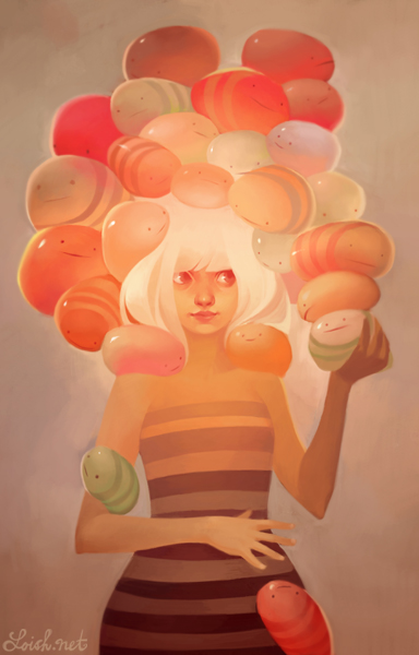
Lois Van Baarle : Female

Lois started teaching herself to draw digitally in 2003. She was born in Holland and has dutch nationality, Shes lived all over the world, including the United States, Indonesia, France and Belgium. Upon finishing high school in 2004, she studied animation in Ghent (Belgium) for a year and then moved back to her home country to study animation at the Hogeschool voor de Kunsten Utrecht (HKU) in Hilversum. She is currently a freelance illustrator and animator located in Utrecht.
Contact Details : info@loish.net
Age : 26

The words of Lois Van Baarle

Inspiration
Many people ask me where I get my inspiration and ideas from. I am often inspired by other artwork that I find on the internet, through DeviantArt or browsing websites. I watch a lot of movies and animated films which are sources of inspiration too. I also have a lot of friends who draw or animate. The things which most often inspire me are colors or color combinations, which usually give me an idea for a drawing and motivate the drawing process.
Artistic Influences
When I was 15, I was inspired by japanese drawing styles (animé and manga), as well as various french comic artists (particularly the work of Aurore BlackCat) and Art Nouveau (particularly Alfonse Mucha). After joining DeviantArt I became very inspired by a wide range of other artwork on the site, mostly digital paintings. My DeviantArt favorites (a collection of images on the site which are my personal favorites) gives a pretty good idea of the type of artwork that inspires me, as well as this influence map I created in August 2010:
Developing my own style
Some people ask me how I managed to develop my own style. It wasn’t really a conscious decision I made, nor do I have any specific tricks or methods to doing this. As lame as it sounds, I suppose developing your own style has to do with drawing a lot and very often. The more you draw, the more your work evolves and you start to find the ways of drawing which suit you best. It's important to nurture these unique approaches and not to be afraid to approach things differently if it feels right to you.
Getting started with digital art
I’ve been asked by people who are just beginning to draw digitally for tips on where to begin. In my case, I started by just messing around in photoshop and other digital programs, not expecting too grandiose of an outcome. I draw a lot of smaller drawings in a day, rather than putting a lot of my time into larger, more elaborate pieces. The more detailed digital works came gradually as my skills improved. So a more concise answer would be: draw a lot, draw fast, and experiment!

10 Reasons why I like Lois Van Baarle:
  1. Very Creative and Origonal
  2. She uses colour really well
  3. Unique Style
  4. Her animations are very well crafted
  5. Humourous Animations
  6. Very detailed work full of tones.
  7. Feminie Touch
  8. Great Sketches in her development work
  9. Imaginative design and mind
  10. Cartoon style illustrations
 
Company : Neon Gravy

Neon Gravy is a small studio based in Huddersfield consisting of three designers; James Burlinson, Richard Nabarro and Jesse Brough. They have experience within Graphic Design, Illustration, Photography, Web Design, Album/Single Art, Packaging Design, Concept Design/Art, Magazine/Editorial/Book Design, Product Design, Character Design, Wall Art, Branding, Promotion, Video Editing, Animation, Fashion and more.
I found out about them a few years ago when talking to a work mate who knew one of the lads in the firm, he told me about their work and have been a fan ever since. They are all still in Uni so their site isn't updated as much as I'd like.

Contact Details : creative@neongravy.com
Tel : 07729992499
 http://www.neongravy.co.uk/


10 Reasons why I like Neon Gravy:
  1. Inspiring Individuals
  2. Experimental Design
  3. Great Illustration Styles
  4. Branding logos are well crafted
  5. It seems like they have similar interests in design to me
  6. Great Use of Colour
  7. Textures
  8. Clever Innovative designs
  9. Work well in collaboration
  10. Awesome work

Tuesday 6 December 2011

How to : Shirt Ironing Temperatures

Research

I have come across some information which displays what temperature the iron must be on when dealing with different materials on http://laundry.about.com/od/ironing/a/irontemp.htm

Using a scale of 1 to 7 - 1 being cool, 7 being very hot. To fill in the gaps and prevent disasters, here is a simple chart to help you.

Ironing Guidelines

Fabric Iron Setting Tips
Acetate 1 Press on wrong side while damp.
Acrylic 3
Beaded 1 Place on plush white towel, press on wrong side.
Cashmere - Do not press, steam only.
Corduroy 7 Place on plush white towel, press on wrong side. Use steam on front to refresh crushed pile.
Cotton, lightweight 5
Cotton, heavyweight 7 Press while damp.
Damask 5 Use cloth between fabric and iron.
Lace 3 Use cloth between fabric and iron.
Linen 5 Iron on wrong side while damp.
Nylon 1
Olefin 3
Polyester 3
Ramie 3 Iron on wrong side while damp.
Rayon 3 Iron on wrong side.
Satin 3 Press on wrong side with cloth between iron and fabric. Use no steam.
Sequined fabric - Do not iron, use light steam.
Silk 3 Press on wrong side. Use no steam.
Synthetic Blends 3
Velvet 3 Place on plush white towel, press on wrong side. Use steam on front to refresh crushed pile.
Woven wool 3 Use a damp cloth between iron and fabric. Iron on wrong side.

Info Graphics


I have found a collection of Info graphics that I like and think may help with our project at the moment.


I really like the style of this info graphics piece, its simple and informative, I like the typefaces used they are legible and appealing. 


This is a quite humorous info graphic piece, I like the illustration style and the layout, this is something to consider when designing our booklet.


Here is a short video I found useful