Tuesday 22 May 2012

OUGD401 END OF MODULE EVALUATION


1. What skills have you developed through this module and how effectively do you think you have applied them?

From this module I feel I have a better understanding of design. Although I am not the best at wording things I definitely find it easier to analyse work. The DIET evaluation method has helped to identify problems or issues with my work this is a useful method which I will continue to use. This module has helped me pick up a book for the first time in years which I think is a wonderful thing. Before this course I hadn't read a book for years and found it quite difficult to read. As a result of this I feel more confident with my reading. I chose a fairly hard book which took me ages to read and I found myself researching lots of words but afterwards I felt I had accomplished something.

2. What approaches to/methods of design production have you devloped and how have they informed your design development process?

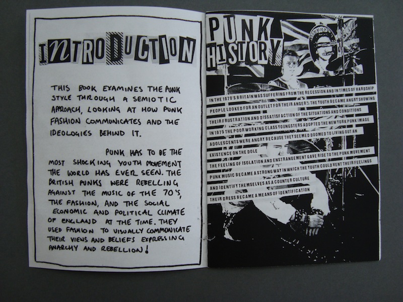
For the publication I found my main method of design was trial and error. I spent allot of time scanning and cutting up lettering and rewording and writing. It took me at least 5 mock up books until I came to my final result, as I created each one I kept identifying things that needed changing or improving so I had to rescan aspects of my design. This process has helped me develop my practice and has also informed me that planning is essential, I found I have spent the last week running on 2 hours sleep a day as I was staying up all night making corrections and changing my design to get something I was really happy with. If I had left a bit more time for my publication I could of avoided this problem. The crits were also a useful process I took on board the comments from the final crit and went away and made my amendments and I feel this has really benefited the Zine greatly. I found most of the lectures particularly useful too, the communication lectures in particular gave me a starting point for my publication

3. What strengths can you identify in your work and how/will you capitalize on these?

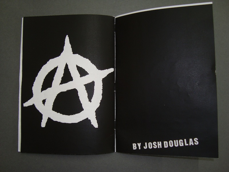
One of my strengths for this project I feel was the fact I tried something new. I have never done collaging before or used the scanner for design. Although the process took twice as long I had a lot more fun and really enjoyed creating my publication. I tried to have a mix of media , using hand drawn images, text, photos, and digital type. This module has taught me to not stick to what you know but experiment and try something new. I am still trying to find what truly interests me within graphic design but I wont find out until I keep experimenting. another strength is the fact I revisited my publication adding new design elements like the cut out sections and extra quotes taking it that extra mile, I have learnt you can never do enough, there is always more you could do to improve your work.

4. What weaknesses can you identify in your work and how will you address these in the future?

I feel my essay has let this module down. I find it quite difficult to get my thoughts down on paper in a intelligent mannar. My essay style was very conversational and I found it difficult to structure my essay in a way that flows and makes sense. This can only improve with practice and I think reading could help me too, I think I could of done with some more quotes too to back up my argument. In terms of my publication, I think the content I wrote could of been worded better as it does not sound that intelligent but I suppose it kind of compliments the punk DIY image intended. I think my design process could of included more development work and design sheets, it feels like I have done masses of work but on paper not that much, I think because most of the time was spent scanning and writing it doesn't look that much even though I spent ages doing it all. I will definitely get all my ideas down on paper from now on even if they are rough or unfinished, it will all help to outline how I have got to my final outcome.

5. Identify five things that you will do differently next time and what do you expect to gain from doing these?

  1. Plan time better - I have probably said this for every evaluation but it has definitely been an issue all year. I think I am gonna start staying an extra hour every night after college in order to stay on top of my work.
  2. Read More - From this module I have learnt reading is essential. It helps build vocabulary and will also help me to analyse work in a more professional manner
  3. Research more into lectures - I feel I could of done some extended research on lecture themes this will help my overall practice so I know whats out there in the world.
  4. Experiment - with different media, although I tried a few different things, there are other processes I am still wanting to try.
  5. Use the library more - This module has made me realise the importance of the library. It is a very valuable source that I should not take for granted.
6. How would you grade yourself on the following areas:

Attendance : 5
Punctuality : 5
Motivation : 4
Commitment : 4
Quality : 4
Quantity : 3
Contribution to the group : 4

PUNK A VISUAL LANGUAGE EDIT

After I spoke to Jo on friday about my publication she suggested it could be represented in a more visual way and she liked my original idea of cutting the pages. Since then I have made some corrections adding cut out elements and also introducing so valuable quotes from The Meaning of style from semioticians Stuart Hall and Umberto Eco. I am happy with the out come and feel I have maintained that punk DIY aesthetic I was going for conveying my messages clearly and in an interesting way.

Mistakes// Corrections

 I decided to add a vibrant pink as suggested in the crit
but I feel this takes away its cheap throw away feel.


Corrected Version

 I cut out holes revealing the punks eyes on the next page.
Which is related to the safety pins.


 Same again with the Bin Bag Clothing
I added in quotes too hand writing them then scanning them in. 
I am really happy with the outcome.

Monday 21 May 2012

Bibliography


John Berger (1972). Ways of Seeing. London: Penguin. 135.
John Berger 
Ways of Seeing
1972
London
Penguin
Page 135

Leon Watson. (13/01/2012). Spot the difference: Damien Hirst painted only FIVE of the 300 spot paintings' in his latest collection Read more: http://www.dailymail.co.uk/news/article-2086017Damien Hirst painted FIVE 300 spot. Available: http://www.dailymail.co.uk/news/article-2086017/Damien-Hirst-painted-FIVE-300-spot-paintings-latest-collection.html. Last accessed 16/01/2012.
Leon Watson
Spot the difference
Daily Mail
13/01/2012
http://www.dailymail.co.uk/news/article-2086017/Damien-Hirst-painted-FIVE-300-spot-paintings-latest-collection.html

Malcom Barnard. (2005). Graphic Design and Art. In: . Graphic Design as Communication. .: Routledge. 163-173.
Malcom Barnard
Graphic Design as Communication
26 Jan 2005
Routledge

Jonathon Baldwin / Lucienne Roberts (2006). Visual Communication from theory to practice. Case Postale: AVA Publishing 
Jonathon Baldwin / Lucienne Roberts
Visual Communication from theory to practice
2006
Case Postale
AVA Publishing

Essay


Could it be argued that fine art ought to be assigned more value than graphic design?

Both graphic designers and fine artists produce creative pieces of work, but for different reasons and targeted at different audiences. A graphic designer’s job is to communicate a message to a mass audience, whether it is to instruct, inform or inspire, whereas the artist’s job is thought to be about self-expression and hidden meaning. Fine art can be rather subjective, the artwork is generally aimed at an elite target market associated with high culture. Some people would argue that this gives art more value than graphic design, as only a select number of people can understand and appreciate the work. However, surely a good piece of design that communicates to the masses has more value, as it serves a purpose and has a function. Most graphic design work is understood by the majority of the population so certainly this should give the work higher value. Artists such as Jackson Pollock have been renowned for creating ‘art for art's sake’. His painting Lavender Mist (1950) is merely a canvas covered in splattered paint, which may be full of self-expression and experimentation but simply has no function. Does something with no function have value? Only a niche market of people understand his work as opposed to something like road signs. Road signs are understood all over the world and they communicate a clear message used in day to day life. It could be argued that they have definitely had a bigger impact on the world today in comparison to famous works fine art. But it is distinguishing the difference in the value between fine art and graphic design which is difficult, as it all fall down to the reaction of the audience.

Some people believe that because artists have the creative freedom to do whatever they want, their work is of a higher worth to that of a graphic designers who is paid to work to a set brief. In chapter 8 of Barnard’s, Graphic Design as Communication, there is a quote from Walker which says, ‘designers work to briefs and specifications laid down by clients where artists enjoy artistic freedom’ (Barnard, 2005, p.163). but is this the case or not? The book mentions a contract between Domenico Ghirlandaio and Father Bernado regarding the Adoration of the Magi in which it says, ‘in particular according to what I, Fra Bernado think best’, this is referring to conditions of the brief. This brief left the artist with little scope for self-expression or creative experimentation putting him into the same situation as a graphic designer but this doesn’t necessarily mean the work lacks value, as value lies in the eyes of the audience.

Fine art is very much about ownership and reputation whereas graphic design is fairly anonymous. People of the art community value graphic design as less important as they perceive designers as wage labourers, solving problems for money, but is this not the case with artists? Artists still need to make a living and put food on the table and the way they do this is by selling artwork. This is somewhat of a hypocritical way of valuing designers work. In Barnard’s Design as Communication, he says, ‘there is some point at which the inevitability compromised by economics: what is produced has, eventually, to be marketable in order for the artist to be able to live. Even in the limit cases, there is something like a client and the artist is constrained to produce something that the end-user will want to buy.’ (Barnard, 2005, p.163) This basically demonstrates how graphic design and fine art have the same fundamentals, they both work to a wage, but the work they produce is aimed at completely different audiences. If the work produced, is only understood by a select group of people should it have more value? A fine artist's way of looking at it creates a kind of hierarchy system in which the lower class and upper class are segregated. In the past the upper class more educated people of the art community were thought to be of more importance, as they understood the subjective work that artists were creating whereas graphic design, aimed at the masses, was deemed less valuable as it was easy to understand and lacked self-expression and hidden meanings. In Jonathan Baldwin’s Visual Communication from Theory to Practice he says, ‘a design aimed at a specific audience will have more effect than when aimed at a wide one’ (J.Baldwin, L.Roberts, 2006) This is true however it all depends who it is aimed at. Fine artists will definitely agree with that statement but as a whole, something that everybody can understand should be seen as more valuable to the masses.

In Baldwin’s, Visual Communication from Theory to Practice, he talks about the value of art and design in mass culture and how the artist’s reputation adds value to the work. He says, ‘the focus of consumption is on the status of the designer or director. In addition the number of people who can afford to buy the brand is limited by the cost, hence perpetuation the sign of exclusivity. The true meaning of an artefact only becomes apparent when it is consumed.’ (J.Baldwin, L.Roberts, 2006) This is an alternative way of observing the value of art and design work, almost distinguishing its value solely based on the amount of money the work can produce which is a rather consumerist approach. Fine artists claim that they do not create their work to sell a product or promote a service. They create it solely as a means of self-expression so that it can be viewed and appreciated by others. In Barnard’s Design as Communication, he states that ‘art is about self-expression. It is a manifestation of an internalised world-view. Design...has been created with an end user in mind...it is ultimately designed for the market’ (Barnard, 2005, p.163) Fine art in respectively, follows these same principles, artists produce work with the intention to sell and make a living.

For instance, the work of Damien Hirst should not be seen to have higher value than an integral pieces of design that communicate to the masses every day such as road signs. Hirst’s work may sell for millions of pounds but half of the time he doesn’t even create the work himself, he commissions others to carry out the hard work for him. An article from the Daily Mail online commented, ‘when asked how he could justify putting his name to works made by others, Hirst said the questions were “totally missing the point... It amazes me that I still get asked these questions” he said. You have to look at it as if the artist is an architect, and we don’t have a problem that great architects don’t actually build the houses.’ (Watson, 2012) This takes away its cultural value putting the emphasis on the paycheck, people merely value his work based on his reputation when in fact, he doesn’t do half of the work he gets credit for. Whereas road signs have definitely been more iconic and influential to a larger number of people, which should surely give the work higher value as they suit a purpose and have value worldwide value. In John Berger’s book Ways of Seeing, he says, ‘art is a sign of affluence; it belongs to the good life; it is part of the furnishing which the world gives to the rich and beautiful.’ (Berger, 1972, p.135) This is a rather condescending and elitist attitude to way we perceiving fine art, as it cannot be enjoyed by everyone. It has always been associated with an elite audience of art fanatics that see themselves immersed within a higher culture. They believe that graphic design is too easily understood giving it less value to that of a complicated painting.

Both graphic design and fine art have value but which is deemed more valuable all depends on the audience. Fine art will definitely be perceived as more valuable within the art community. However, graphic design definitely has more value across the general public. It affects everyone in day-to-day life whether you realise it or not, something that is recognised and understood by the masses has more value to our society as a whole, rather than an obscure and ambiguous piece of art, containing hidden meanings and messages that only a handful of people can understand. Nowadays reputation is too important in the fine art world, it is almost as if a respected artist could pretty much throw something together in five minutes without thinking about it and fellow artists will start adding abstract meanings to it that were never intended. This is simply due to reputation of the artist himself and the associations of class and culture that come with fine art . This is not valuable; it is simply people looking into things too much. Fine art is definitely full of high culture and the work does carry value but only for a select few people in the world but as a nation, the ability to learn, inform and communicate in a simple design language is much more valuable to the masses. Fine art is important, but is more of a luxury that only a select group of people enjoy, whereas graphic design has global recognition.

Final PUNK ZINE - Punk A Visual Language

After lots of late nights cutting and scanning and find images large enough I finally finished my publication. I was quite fortunate that I could get away with printing in the mac suit as the original punk zines would of been the same quality if not worse.

I saved each page as a TIF file from photoshop then inserted them into indesign creating my publication. This made printing allot easier as I was able to double side print which was very helpful. I am really happy with how it turned out, I feel I have definitely captured that DIY feel that existed in the original punk zines. I have presented the information as simply as possible to try and make it as understandable as I can.


Crit Feed Back


Strengths

Subject suits the DIY format, - Photocopied Zine
Hand written works well
Punk typography works
Throw away feel
Easy to digest

Improvements

More content
use more semiotic terms
too structured - more chaos
Needs Colour - pink, black, blue, yellow

I am happy with the feedback I received it was fairly possitive. At the crit I only displayed an unfinished mock up of my Zine that was missing around 8 pages. Since then I have correct my Zine adding more content. I have tried to make it as easy to digest as possible. Unfortunately I have not had time to go back and make it more chaotic. I could print out my pages rip them up and re scan them but with the time left I don't think this is worth while doing. I also considered adding colour but this would break the cheap throw away aesthetic I was going for. I could produce a limited edition version with colour which would be quite nice. I originally wanted to produce a hard back more interactive book bound with TARTEN covered in safety pins but time was an issue. It would of been nice to incorporate my cut out pages from my early ideas. I feel this would help to visually communicate the meanings in a more interesting way. Revealing aspects of the following page through holes and gaps.

Friday 18 May 2012

Context of Practice - Zine - Final Pages

After I had made a mock up of my zine I started to make the pages. Using a combination on images from the web and books I pieced together my pages. I prepared my images on photoshop playing with the levels in order to get that punky look. I decided to stick to just black and white as most of the punk zines came in the cheap affordable format.

Front Cover


After ripping up my text and image I scanned it in to the computer then edited it on Photoshop 
I played about with different overlays to try and get a punky grungey feel adding noise and
adjusting the levels option to bring the blackness out.

Introduction
 I tried to keep the format of the book quite even.
1 page hand drawn the next Digital and so on...
Here is my section on the punk history overlaid over
a picture of the sex pistols. Outlining how punk began. 
 I tried to sum up semiotics within fashion as best as I could.
I was only really concentrating on one aspect of semiotics
and that was the connotations behind their clothing
choice.
Diagram of Sign 
Swastika 
 Ripped Clothing
 Safety Pin
Dog Collars 
 Bin Bag Clothing
 Toilet Chain Necklaces
The death of punk - I tried to explain how incorporation killed
punk in as few words as possible as no one likes reading loads
of text. 
Punk art - influences taken from punk style.

Monday 14 May 2012

Context of Practice - Punk Content

Originally I wanted to just use text from the books I rented but I realised the extracts were far too long and complicated for what I wanted to communicate. So I from reading online articles and extracts from the book. I have tried to sum up the messages in a shorter more understandable way. I planned out the sections in my zine first of all then got to work sorting the content. I wanted to include quotes but this is something I am still yet to do. 


Content List


  • Introduction
  • Introducing Semiotics
  • Diagram
  • History / Origin of Punk
  • Swastika
  • Ripped Clothing
  • Toilet Chain Necklaces
  • Safety Pins
  • Dog Collars
  • Bin Bag Clothing
  • The death of punk - Incorporation
  • Influence on Punk Art
Working Out What to Say


Introduction // Semiotics Draft

THE FOLLOWING BOOK LOOKS AT THE PUNK STYLE WITH A SEMIOTIC APPROACH. I WILL BE LOOKING AT HOW PUNK FASHION SPEAKS THROUGH ITS CLOTHES AND THE IDEOLOGY BEHIND IT.

THE PUNK REVOLUTION HAS TO BE ONE OF THE MOST SHOCKING YOUTH MOVEMENTS THE WORLD HA S EVER SEEN. THE BRITISH PUNKS WERE REBELING AGAINST THE MUSIC OF THE 70’S, THE FASHION, AND THE SOCIAL, ECONOMIC AND POLITICAL CLIMATE OF ENGLAND AT THE TIME.

PUNK FASHION WAS A WAY OF VISUALLY COMMUNICATING THE VIEWS AND BELIEFS OF THE SUBCULTURE, THEY MUTILATED THEM SELVES WITH SAFETY PINS AND TORE THEIR CLOTHES  IN AN ATEMPT TO CONVEY A MESSAGE AND IDENTITY.

THIS INTENTIONAL FASHION LANGUAGE CAN BE ANALYSED USING SEMIOTICS ( THE STUDY OF SIGNS ) IN TERMS OF FASHION, THIS IS WHEN AN OBJECT OR THING HAS A CULTURAL VALUE DIFFERENT TO ITS ORIGONAL CONNOTATION.  FOR INSTANCE THE SAFETY PIN WAS TAKEN FROM ITS ORIGINAL CONTEXT, WHICH ONCE SIGNIFIED NAPPIES AND PARENTHOOD. AND WAS GIVEN A WHOLE NEW MEANING SIGNIFYING ANARCHY AND REBELION AMONGST THE PUNK SUBCULUTURE.

THE PUNK STYLE CAN BE READ AS A VISUAL CODE EXPRESSING ANARCHY, REBELLION, POVERTY AND  OTHER BELIEFS. A CODE IS A SET OF SHARED RULES THAT CONNECTS SIGNIFIERS WITH SIGNIFIEDS.

Punk History Draft

Britain was suffering from a recession at the time, and in times of extreme hardship, people look for an outlet for their anger. Adolescents became angry and showed their frustration and dissatisfaction of situations or conditions. In 1975, the poor working class youths of Britain began to use the style of the New York punk scene. Adolescents were angry because they seemed domed to living out an existence on the dole. This, coupled with normal adolescent feelings of isolation and estrangement gave rise to the punk movement. Punk music became a strong way in which the youth could vent their feelings and identify themselves as a counter culture. Their dress also became a means of identification. “Punk as a subculture was beginning to take shape, conformity was what punk stood against”