I have researched into 45 Graphic Designers that in my opinion relate to the different lecture programs. I found this process really enjoyable and beneficial, I have come across new and interesting designers which relate to my practice. This resource will prove useful.
Lectures
Modernism
Postmodernism
Graffiti / Street Art
Film Theory
High Culture / Low Culture
A History of Type
Media Specificity
Advertising
Communication
Modernism
Face Studio http://www.designbyface.com/


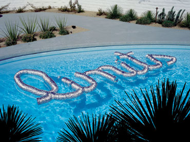
 This is a great example of modernist design by design by face studios
Great use of a simple grid and use of minimum colour
Paul Renner http://www.paulrenner.net/


Another brilliant example of modernist design. Futura font created by Renner
it displays a grid system with use of simple geometric shapes


crooked setting and muted palette accented by the burnished
Modernist red. instead of using the lines and blocks and circles modernist design would usually have he has replaced this
with pure type

Figure created from simple geometric shapes. He has used bold colours which
stand out catching the viewers eyes. There is little decoration and it is easy to read
Interesting website on a Museum exhibition showcasing his crazy work
http://www.designboom.com/weblog/cat/8/view/5247/fortunato-depero-museum.html
Post Modernism
Jamie Reid http://www.jamiereid.org/
Article with Jamie

I really like Jamie Reids work I have recently been doing a project which was heavily inspired by his work
He has a real DIY feel to his work using a cut up collage technique form function follows form.
He is very experimental and does not stick to a grid. He has a range of different colours within his work.
Oliver Flippence http://www.behance.net/ollieflipp


‘Design Museum’ in ‘Shad Thames, London’.
Desipite saying post modernism all over its post modern definitely shines through
with its crazy layout clearly not following a grid. He has a bold use of colour which
is eye catching for the viewer.
Wolfgang Weingart. (collection of work)


Swiss designer and typography legend. His work was very playful
and experimental. Function clearly follows form, he has
experimented with type here producing a very interesting eye catching
work.
Neville Brody http://www.researchstudios.com/neville-brody/

Overlaying text over image is a sign of post modernism. The type in this piece is playful and
eye catching. He has overlapped type as well as using a range of colours.
Barbara Kruger http://www.barbarakruger.com/

She has used a Sans Serif font which is common in Post Modern Graphic Design.
Cut up collage feel like Jamie Reids with no use of grid.
Graffiti
Shepard Fairey http://obeygiant.com/
http://www.theblaze.com/stories/artist-behind-obama-hope-poster-pleads-guilty-to-criminal-contempt-in-nyc/

making it that bit more acceptable. His work featured in Obamas campaign
in America. Few colours used BOLD STATEMENTS.
Banksy

As obvious as this choice is I really like his work.
His art is humorous and also reaches out to people.
His beliefs and views shine through his work. He tends to
stick towards the more stencil art side of graffiti.
Blu
Blu is an incredible graffiti artist who has opened up a whole new
era for graffiti. This combination of film and graffiti works so well.
Concentrating on the location and humour of his work.
Reverse Graffiti http://www.reversegraffiti.co.uk

this is a more environmentally friendly way of putting your stamp on
the urban surroundings.
Space Invaider http://www.space-invaders.com/
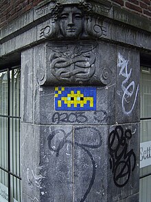
After the lecture I researched a little into space invaider
I really like his inventive approach to graffiti. its more of an art form
than criminal damage when its in this form.
Film Theory
Olly Moss http://ollymoss.com/galleries/movie-posters


Olly moss has to be one of my favourite designers I love
his simple silhouette pieces. He has produced a series of movie posters
which catch the theme of each really well.
Saul Bass http://designmuseum.org/design/saul-bass
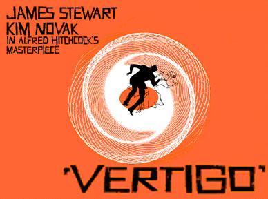
Saul Bass's movie posters are inspirational
they are simple and effective. He uses simple colours and
uses significant aspects of the films in his posters.
Daniloco http://all.worth1000.com/artists/daniloco/portfolio

Daniloco has a simple design style which
works well with the is Jaws poster. Easy to understand
and eye catching. Resembles the film well.
NomeDaBoy http://all.worth1000.com/artists/NomeDaBoy

This trainspotting poster is brilliant. It only makes sense however
if you have seen the film. Could be quite confusing but nether the less
it made me laugh.
Matt Renzetta http://mattranzetta.blogspot.co.uk/


I only recently came across the work of Matt Renzetta but immediately took a liking
I love his simple style and colour scheme. Once again aspects of the film have been
incorporated into his work subtly which works well. Similar style to Olly Moss
High Culture / Low Culture
Greg Mike http://www.gregmike.com/outdoors/


Greg mike produces low culture art, he produces works of graffiti and
other urban installations including trash can characters. However his work has appeared in
exhibitions.
Craig Scott
http://www.behance.net/gallery/Caffeine-Nicotine-Magazine/1196449


Clear crisp layout and format with High End Fashion
content appealing to a select audience.
Zim and Zou
http://www.zimandzou.fr/backtobasics.html


considered as both high culture and low culture, it takes a low cultural subject
and presents it in a beautifully artistic way.
Jason Munn

work like this and can be associated with low culture as this something
that appeals to the masses.
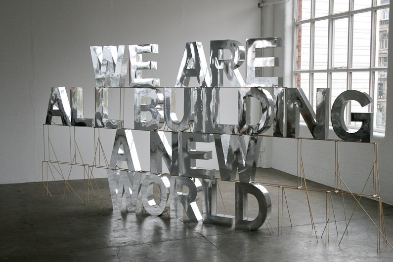
Mark Cleary
http://www.behance.net/markcleary


This is a really creative and inventive way to appeal to a mass audience
this type of art installation is an example of low culture.
History of Type
John Baskerville
http://en.wikipedia.org/wiki/Baskerville

Baskervilles typeface was a break through in the typography world
he created a more readable serif typeface
James Worton
http://jamesworton.com/


James Worton is a graphic designer and typographer
that produces alot of hand drawn type, he uses a combination of
old and modern styles in his work.
Boa Mistura
http://www.boamistura.com/


Art collective Boa Mistura in Sao Paulo painted words of inspiration and hope in alleyways which are only readable from a certain angle.

“The work of Boa Mistura is all about the love of graffiti, colour and life. Made up of a group of 5 spanish artists. This is a great example of new and innovative typography taking into account perspective and placement.
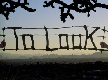
Sandy Smith
This is the work of sandy smith, it is a good example of where you can take
typography it doens have to be paper based it can be 3D
This installation typography is eye catching and inventive.
Stefan Sagmeister


Here is another excellent example of inventive typography
he has used various different media to produce these
incredible examples of type.
Media Specificity
Seth Easter Design

Seth produces his work using projectors. This is a very
creative and fun way to display work, the possibilities are endless
you can work at different scales and in various locations.

Here is a wonderful example of design in the urban environment and also
an example of WEB based media as it has been turned into a GIF image
Simon Duhamel
http://www.simonduhamel.com/

This is an interesting example of 3D media, concentrating
on perspective. It would also class as web based as yet again it is
another GIF image.
Marius Wathne

Graphic Design can be print based which is quite common
this is a really nice example of well produced design.
Jan Wöllert and Jörg Miedza

Design can be photography based, these two designers
produce light paintings.
Advertising


This piece of advertising is an excellent example of creativity
it has been tattooed onto a large piece of skin.
it has been tattooed onto a large piece of skin.


This is an interactive piece of online advertising for cabin in the woods
letting fans experience aspects of the film online.
Jacques Pense
http://www.behance.net/JacquesPense


I like this creative advertising technique
in a print based format it Engages with the viewer
I like the humour behind it also.
Matt Chase
http://chasematt.com/

I think Matts re-branding of the postal service is brilliant
he has attracted the youth with these designs, they are much more
modern and interesting hes experimented with different deliveries too.
Tati Ferrigno
http://www.behance.net/tatiferrigno

Use of women to appeal to men
good advertising technique. The images
try to represent the lifestyle that goes
with Miller
Communication
Squat Design
http://www.squatdesign.com/
the form of animation which has worked well here.
Its fun to watch and is easy to understand.
2012 Branding Team
http://creativereview.co.uk/cr-blog/2009/october/london-2012-pictograms
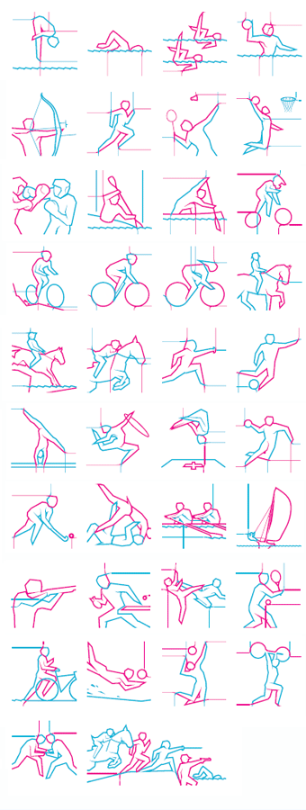
The new 2012 olympic pictograms have recently been brought out in my opinion
I prefer them to Otl Aichers original designs, They visually communicate
the sports well with a stylish new modern feel to them.
Vasava

reaching out to the youth with its use of bright colours
trying to brand its new Basketball project.
Apple

The apple logo visually communicates style
and perfection.
Lindon Leader
http://www.leadercreative.com/
http://blog.pixellogo.com/logo-brand-review/fedex-logo-design-and-its-hidden-message/

The logos hidden arrow suggest the company is
speedy and reliable. Its simple attractive and
recognisable
No comments:
Post a Comment