Saturday 29 October 2011

What is a Crit?

What is a crit...
  • An evaluation of work looking at good and bad aspects, seeing what works and what doesn't work.
  • Opinions
  • Feedback, constructive criticism from others 
  • Idea generating session
  • Discussion to help develop work
Why are crits useful?
  • Develop Ideas
  • Help with Research
  • Find out how the work is being communicated to the audience
  • Helps progress and improve ideas
  • Seeing where work can be improved
  • Keeps you on track/in the right direction
  • Helps analytical skills


D escribing- what is it?
I nterpreting- what is it about?
E valuating- how good is it?
T heorising- does it solve the problem?

Questions to be asked?

  • Inspiration?
  • Function?
  • Target Audience?
  • Colour Psychology?
  • How would you improve it?
  • Intended Reaction?
  • Symbolism?
  • What are you trying to communicate?

Friday 28 October 2011

Proverbially Yours//Message & Interpretation // Research

Research

Proverb : "two wrongs don't make a right" 

Two wrongs make a right is a logical fallacy that occurs when it is assumed that if one wrong is committed, another wrong will cancel it out. This statement is seen as true to some people because 2 negatives indeed make a positive in math (3-(-3)= 3+3). However, a person with common sense would know that two wrongs don't make a right.
  • Speaker A: You shouldn't embezzle from your employer. It's against the law.
  • Speaker B: My employer cheats on their taxes. That's against the law, too!
The unstated premise is that breaking the law (the wrong) is justified, as long as the other party also does so. It is often used as a red herring, or an attempt to change or distract from the issue. For example:
  • Speaker A: President Williams lied in his testimony to Congress. He should not do that.
  • Speaker B: But you are ignoring the fact that President Roberts lied in his Congressional testimony! 

Research 


I thought this was quite a humorous look on the proverb. Its simple and effective. I will experiment with ideas like this.


 I thought this t-shirt was pretty funny its quite clever, the typography is terrible I feel but the concept it still pretty good.


I quite like the idea of the road sign being incorporated into my design. Road signs are something everyone looks. They are simple bold and memorable. Colour plays a huge importance too. The image above is a take on the proverb.


Imagery Research
 
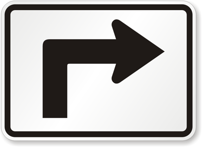
I looked at how I could symbolise right and wrong using imagery. Sticking with the concept of road signs and making the right decisions along life's road or journey. I imediatley thought about wrong turn  and the signs that represent this. Obviously the right turn sign could reprents Right Desicions.
 
Wrong 


Right


Inspiration
 
Here are some examples of work that I feel is relevant to my work:
 
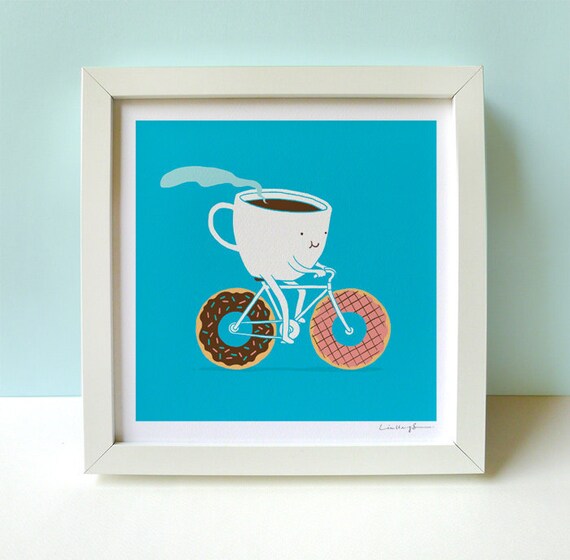
 Coffee and Doughnuts by I love doodle

I really like this print. The illustration style is brilliant. I really like the colours used in this piece. The image is humourous and playful. The blue works well.
 
Olly Moss
 
 The work of Olly Moss is really interesting. I like his take on the well known Keep Calm Posters. The font and layout works well in this portrait format.
 
 
Here is another example of typography I like, the composition of the piece works well. I like the sizing of the font it draws you in closer and closer. 
 
Design Times Issue by Radio
 
This image is really bold and eye catching, The shapes are simple and recognizable. The colour scheme works really well. I will definitely play around with these colours.
Here are some simple signs I like the look of. The black and white make the signs legible and bold. I like the simple use of shapes and type.

Thursday 20 October 2011

ALPHABET SOUP//TYPEFACE//OUGD403

Alphabet Soup Research

I have been looking at various fonts in order to get inspiration. I have been looking at dinosaur style fonts and illustrated typography. Here is an example of Illustrated type that I really like. Its clear but still legible, his use of close attention to detail has paid off. He has incorporated a reggae style influence and also combined this with wires and speakers. This works really the colour scheme  is quite natural which works well.


Theo Aartsma

Here are some Dinosaur style fonts I found on dafont.com. I quite like the 3rd one down, its illustrated style is interesting to look at and also reads quite well as a typeface.


Here I came across some typography that I like. I really like the colour scheme, its bold and eye catching. He has created a visual representation of the word sweet, using sticky colourful illustrated font. I like this style of visual communication.
 
By Stefan Chin2off
 http://www.flickr.com/photos/72736802@N00/5606068426

 Niels Nolta

Here are some more typefaces I really like, they are all very unique and interesting, Hopefully this spread of typography will help me when creating a font for Sam.
Luke Lucas
 I really like the combination of type and image here, the colours suit the purpose.
Bossco


 Alex Sheldon

 Benedikt Luft
This is a wonderful take on typography he has used a combination of card and plaster-seen to create this 3d type.

Nick Beaulieu
Karl Ouelette

 Visente Garcia Morillo

Elsa Z. Mersayeva 

Said Swayssi


ALPHABET SOUP//TYPEFACE//OUGD403

Alphabet Soup Type Face

Brief

Design a typeface for a full alphabet and glyphs (a to z, !, ?, @, £, :, .) that represents the personality/character of your partner. You will discover their personality/character through a series of set questions.
Using your new found appreciation of the anatomy of typographic forms and the wealth of research that you have already gathered, focus on the manipulation of existing letter forms in order to solve this problem. There is a limited colour palette of black ink.

Background / Considerations


The alpha-numeric forms within typefaces and fonts are vast. Each has been designed in response to a specific problem, set of requirements or design needs. Clarity, legibility, ease of (re)-production, usability and functionality are always considerations but the mood, personality, tone of voice of these forms is just as important to a designer.

This needs to be produced on an A1 sheet of paper.

My partner is Sam, to find out a little bit about each other we interviewed one an other. From the questions that were asked I picked out 5 answers that I feel will be good to work with. The words I picked from the list are Forgetful, Dinosaur, Loyalty, Time Travel and Death. From here I will investigate ways I deliver these meanings through type.

What these words make me think of:

Forgetful:
  • Memory
  • Brains
  • ?
  • Unreliable
  • Dozy
Dinosaur: 
  • Bones
  • Fossils
  • Reptiles 
  • Ancient
  • Pre Historic
Loyalty:
  • Friends
  • Royalty
  • Family
  • Team
  • Trust 
Time Travel:
  • Space
  • Science
  • Time Machines
Death:
  • Blackness
  • Graves
  • Hell
  • Heaven
  • The Devil
  • Skulls
Next I am planning on finding a few typefaces that I can trace over in order to change and develop them into a typeface that represents the the words I have chosen for Sam.

Study Task 2 - Critical Studies Image Analysis Exercise


Here are two different aspects of graphic design from the past, the 1st image is The Uncle Sam Range (1876) by Schumacher & Ettlinger, and the 2nd image is a poster by Savlie Lumley. The 1st image is an aspect of advertising, which at a 1st glance is quite hard to understand, as the oven is not the center of attention. The main focus is on Uncle Sam himself and his dinner party. The image is very in your face and is primarily promoting America. The image depicts 100 years of Independence and is gloating America’s triumph.

On the over hand image 2 is a lot subtler, there is no use of big bold text and bright patriotic colours and symbols like in image 1. This image has been created to try and guilt trip men into joining the war. The poster was made in the time where the army was voluntary; it is a clever way of persuasion as it kind of emasculates men, the hand written style font makes the type read differently, it’s a bit more informal unlike image 1 where big bold gold western text has been used to grab your attention, the gold text represents wealth and power, they have made the U and the S capitals just for extra emphasis. Images 2’s text has underlined and capitalized the word YOU, which automatically links the viewer with the image. It directs the focus of the propaganda directly onto the reader. 

Image 1 is fairly racist, the character on the right has a cartoon like face imitating Africans which is racist, they are trying to make it acceptable which would appeal to lower class as it is quite a low sense of humour. They have gone with the approach of making out America to be top dog, and insinuating America has better food and a better country. They mock the different countries with the list they have, for example saying the Irish just eat potatoes. Although both images exploit the audience the 2nd image is a lot subtler. It kind of paints a picture of the scenarios that men in that time would want to avoid. Men will kind of feel they have to join the army to prove themselves and be a hero to their children. The little boy is playing with soldiers and the little girl is looking at a book on the war, the father looks like he’s trying to avoid the question, he looks kind of intimidating which I feel works well to pressure into the decision. Both Images glorify an aspect of their message.

Image 1 just glorifies America completely; making you want to help out your country where as image 2 refers to the war as The Great War, which is only a presumption that they were going to win as the war wasn’t even over. I feel that image 1 is aimed towards men, probably middle and lower class; it kind of depicts the American dream. Image 2 is aimed at Men obviously and probably mainly fathers that want to do their children proud.

Study Task 1 - 5 Examples of Graphic Design (Love/Hate)

For the contextual studies module I have collected 5 examples of Graphic Design that I love or hate. 

1. Below is the work of Anna Grosh. I really like the hand crafted type she has created. Its extremely detailed but still completely legible. The black and white works really well for this font it has a distinctive contrast and has been crafted to the finest detail. The packaging looks really professional and eye catching. I can really aspire to work like this.


2. I have recently stumbled across the collaborative work of Francois Robert and Rick Valicenti who together combined their photography and graphic design skills to come up with this brilliant book. They have created an alphabet purely using photos of bones. This has worked really well, the letters have perfect form and are legible. It works really well on the dark back ground.


3. I have come across a great illustrator and graphic designer called David Mascha. I really like his use of simplistic curvy shapes. He also uses colour really well, they all go together well and work well on the pale back ground. He uses different textures and patterns in his work too which I believe works very well.


4.  I am not a big fan of Kitty Finegan's work I feel like she has used too much colour in this piece of work. I don't hate it but I don't think its anything spectacular.


5. Finally I found the work of Joe Fenton who's illustrations are amazing. His perfect attention for detail really pays off with his works of art. They are both intricate and eye catching and are beautifully handcrafted. I really like his unique style.


ALPHABET SOUP//VISUAL THINKING//OUGD403

Brief // Alphabet Soup

One of the briefs I am working on at the moment is called Alphabet Soup. I have to produce a set, series or sequence of ten visual variations of a letterform (ten A’s for example) that explore and communicate my interpretation of the word that I selected from the randomiser. Which in my case is the word 'Pop' All designs will be based on existing letterforms and designed to a 15cm x 15cm format. There is a limited colour palette of black and white. 

I researched the word pop and found various meanings: 

  • to make a short, quick, explosive sound: The cork popped.
  • to burst open with such a sound, as chestnuts or corn in roasting.
  • to come or go quickly, suddenly, or unexpectedly: She popped into the kitchen to check the stove.
  • to shoot with a firearm: to pop at a mark.
  • to protrude from the sockets: The news made her eyes pop.
  • pop art
  • popular music: It's the first time she's sung pop
From these definitions I'm sure I can come up with something quite creative. There's quite a few different avenues I can go down with 'pop' and I look forward to experimenting with it.
  
Typography Inspiration

Through research on the internet I have found a selection of typography that I feel relates to my brief and my random word POP!

Submitted by Gwerilla

This example of type was found on www.abduzeedo.com from paul0v2's blog from Typography Mania, it is well crafted and easy to read. I think the word 'pop' could be used to describe this font, as it kind of looks like the lettering has been popped and has flown around the air like a burst balloon.


 I came across this Pop art style piece of design on deviantart on the following link:


I think this is a great style of approach to 'pop' I like its old school theme and use of colours. This Pop Art style of work is very eye catching and interesting, I will look into giving my letter forms a pop art feel. There are many different approaches I can with in this style of drawing. I will have consider colour though as I will be working a black and white format. I will have to get the pop art style across without using these bold outrages colours. 


Submitted by Nitrogliserin


Here is another example I have found by Roy Litchtenstein. I like the style, the combination of dots and blocked colour work really well together.


By Roy Lichtenstein


I came across the image below on www.dafont.com, (http://www.dafont.com/60s-pop.font)the font is called 60's Pop by Galdino Otten, I thought this was quite an appropriate font to use with my subject matter. This definitely screams 60's pop. I also came across a similar typeface in Top Gear Magazine which you can see in my hand collected research below.

By Galdino Otten

Letter Research

I collected various different letters from different magazines in order to get inspiration for my summer brief, here is a selection:


I collected loads of different letters in all different types of fonts from a few different magazines, such as Top Gear Magazine and a Red Bull Magazine. I have messed about with the letters a bit to see which work well. I found a typeface that is similar to Galdino Otten's 60's pop font.

I collected some more fonts on Microsoft Word
to give me a broader range of research.