Brief // Alphabet Soup
One of the briefs I am working on at the moment is called Alphabet Soup. I have to produce a set, series or sequence of ten visual variations of a letterform (ten A’s for example) that explore and communicate my interpretation of the word that I selected from the randomiser. Which in my case is the word 'Pop' All designs will be based on existing letterforms and designed to a 15cm x 15cm format. There is a limited colour palette of black and white.
I researched the word pop and found various meanings:
- to make a short, quick, explosive sound: The cork popped.
- to burst open with such a sound, as chestnuts or corn in roasting.
- to come or go quickly, suddenly, or unexpectedly: She popped into the kitchen to check the stove.
- to shoot with a firearm: to pop at a mark.
- to protrude from the sockets: The news made her eyes pop.
- pop art
- popular music: It's the first time she's sung pop
From these definitions I'm sure I can come up with something quite creative. There's quite a few different avenues I can go down with 'pop' and I look forward to experimenting with it.
Typography Inspiration
Through research on the internet I have found a selection of typography that I feel relates to my brief and my random word POP!

Submitted by Gwerilla
This example of type was found on www.abduzeedo.com from paul0v2's blog from Typography Mania, it is well crafted and easy to read. I think the word 'pop' could be used to describe this font, as it kind of looks like the lettering has been popped and has flown around the air like a burst balloon.

I came across this Pop art style piece of design on deviantart on the following link:
I think this is a great style of approach to 'pop' I like its old school theme and use of colours. This Pop Art style of work is very eye catching and interesting, I will look into giving my letter forms a pop art feel. There are many different approaches I can with in this style of drawing. I will have consider colour though as I will be working a black and white format. I will have to get the pop art style across without using these bold outrages colours.
Submitted by Nitrogliserin

Here is another example I have found by Roy Litchtenstein. I like the style, the combination of dots and blocked colour work really well together.
By Roy Lichtenstein
I came across the image below on www.dafont.com, (http://www.dafont.com/60s-pop.font)the font is called 60's Pop by Galdino Otten, I thought this was quite an appropriate font to use with my subject matter. This definitely screams 60's pop. I also came across a similar typeface in Top Gear Magazine which you can see in my hand collected research below.

By Galdino Otten
Letter Research
I collected various different letters from different magazines in order to get inspiration for my summer brief, here is a selection:


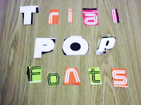
I collected loads of different letters in all different types of fonts from a few different magazines, such as Top Gear Magazine and a Red Bull Magazine. I have messed about with the letters a bit to see which work well. I found a typeface that is similar to Galdino Otten's 60's pop font.


I collected loads of different letters in all different types of fonts from a few different magazines, such as Top Gear Magazine and a Red Bull Magazine. I have messed about with the letters a bit to see which work well. I found a typeface that is similar to Galdino Otten's 60's pop font.

I collected some more fonts on Microsoft Word
to give me a broader range of research.
No comments:
Post a Comment