Colour Prints
Overall I was really happy with how my prints turned out. It was a hectic week of work but the end result has certainly payed off. I learned allot about typesetting during my week printing, it has taught me the physical aspects of designing, working with various typographic elements. The physical nature of the work was allot more enjoyable than been stuck in front of a computer all day. It was also a different way of designing which was much more structured as the process limits how you can design. I found that the grid was really helpful when designing for letterpress as this ensures everything is neat and organised with correct spacing. I was slightly limited when creating my posters as there was a shortage of letters, I had to choose my words appropriately in order to complete each of the statements. Originally I had planned to use just one typeface for the posters, however the lack of type forced me to experiment with various fonts which has actually worked allot better than I expected. I think that using a combination of typefaces and weight fonts has helped to create striking interesting posters which say something about the relevance of letterpress to 21st century graphic designers.
Once I had completed all my prints I scanned them in as you can see here:

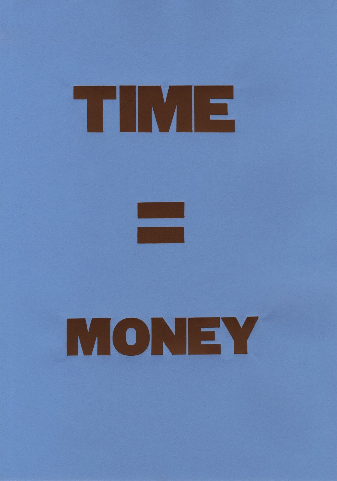


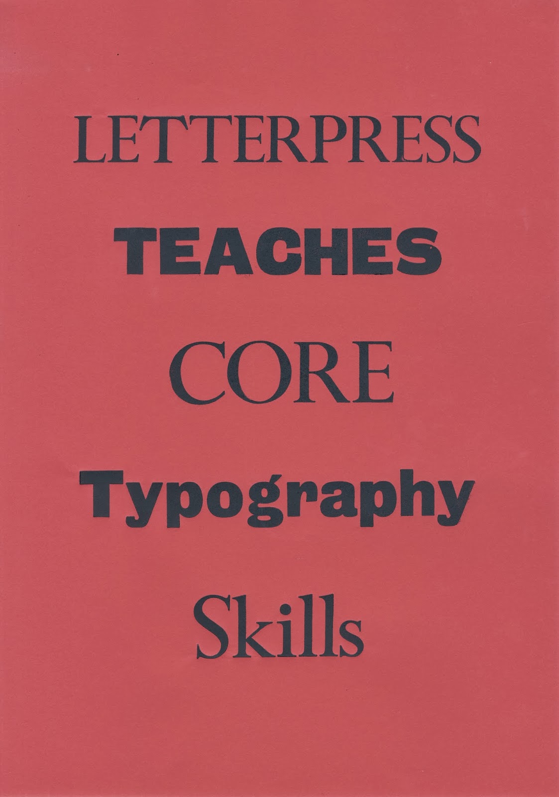


One of the hardest things I found when printing, was laying the paper down in the right spot, because you have to place the paper on the set type it is difficult to arrange it centrally and accurately so as you can some of the posters are slightly off, which slightly lets them down but this is just the nature of the business. I think printing on coloured stock has really brought the posters to life, the series of prints are bold and eye catching and illustrate the tactile qualities of letterpress.
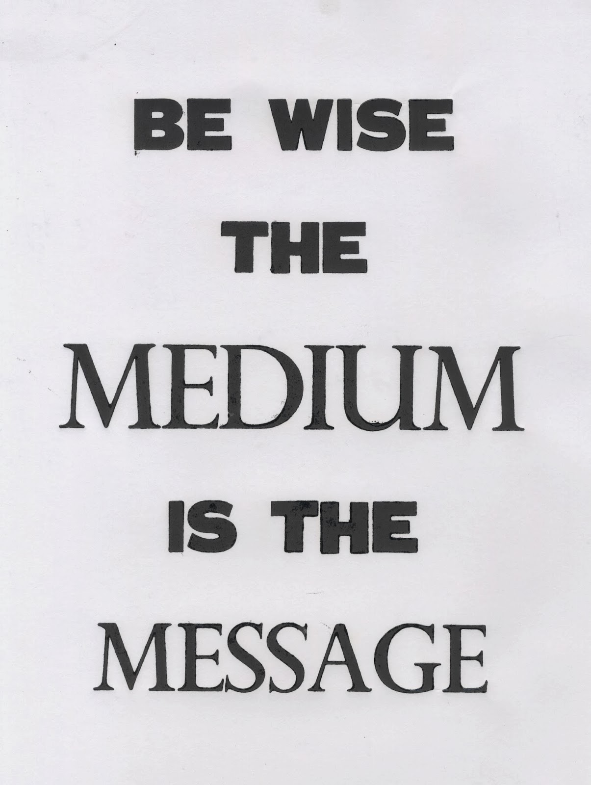
Black and White Prints
I also printed loads of black and white versions experimenting with different stock, I printed on cartridge paper, coated stock and some Lino print paper which created a nice effect when the inks printed.


One of the issues I had when printing was getting the pressure right on the press. As you can see on the right hand side there is a crease between 'Used by'. This could be corrected by taking away padding from the press, I was trying to leave an impression as this is the thing to do in 21st century however it wasn't always easy to leave an impression without creasing aspects of the print. On the left hand side you can see slight smudge marks around the lettering, this is because it is extremely difficult to lift the paper from the type without moving it slightly. I had lots of trouble with this but it all adds to the letterpress aesthetic.


No comments:
Post a Comment