United States Postal Service by Matt chase
Complete re-visualization of our USPS mail system, including logo, letterhead, business cards, packing tape, shipping labels, mailbox graphics, worker uniforms, stamps, stamp dispensers, notepad, weights & prices brochure, fleet vehicle graphics, front-of-store signage, newspaper advertisements and elementary school posters. I really like the colour scheme used in the branding of the mail company. The stamps that have been created are simple and eye catching. I like the use of the simple shapes he has used...simplicity definitely is the best direction.
Complete re-visualization of our USPS mail system, including logo, letterhead, business cards, packing tape, shipping labels, mailbox graphics, worker uniforms, stamps, stamp dispensers, notepad, weights & prices brochure, fleet vehicle graphics, front-of-store signage, newspaper advertisements and elementary school posters. I really like the colour scheme used in the branding of the mail company. The stamps that have been created are simple and eye catching. I like the use of the simple shapes he has used...simplicity definitely is the best direction.
GO GREEN
I came across some environmental stamps on Behance.net by the work of Jessica Andrew. I like her simple illustration style and use of colour. The combination of greens works really well in conveying the environmental issue. Colour will be something of importance to consider.
American Fame Stamps
Here are some more stamps that caught my eye by Stephanie Corda. The mirrored stamps represent the americans quest for their 15 minutes of fame, I quite like the concept and the way they have turned out. They look really intriguing and well crafted. I like the mirror idea, this seems very original and thoughtful.
Environmental Stamps
I love Sharon Silverberg's hand drawn stamps. I think she may of even designed them for a very similar brief. they have a beautiful hand crafted quality and she has been very selective with her colours. which has paid off well.
Homage to the stamp
I love the subtle colours Gavin Potenza has used to create these stamps. The serrated // embossed lines give the stamps a well crafted image. I will look into embossing to create my stamps.
Music Stamps
I like the simple shapes used by Adelaide Follon. These aren't really environmental but I like her style.
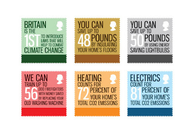
Energy Conservation Stamps by Neil Martin
Nice simple messages conveyed. Good use of colour. Subtle yet eye-catching.
Energy Conservation Stamps by Vicky Barlow
Environmental Stamps by Fanoi Thaqi.


No comments:
Post a Comment