The publication I was designing would fit inside your average CD case, I have decided that the format would be 116mm by 120mm so that it will fit snug inside the Case. I have decided to go with the theme of yellow black and white as this is how most CCTV signs are represented and also yellow and black are warning colours and have connotations of power and order.
FRONT COVER

I decided the best way to represent panopticism visually
would be to use the all seeing eye, as this is essentially what it is.
Its the constant watch of the world, the triangle/pyramid is a shape
that represents power structure and order, whilst also giving reference
to Warning CCTV camera signs which are triangular. The eye refers to the constant watch.

I tweaked around with the design, trying out the stencil lettering
as used in the props but was not really happy with the out come.

I decided the imagery was too simple so I drew a more intricit eye
which made the logo stand out more. The detail of the eye creates
a more informed gaze with the viewer.

I added yellow to the design to reference the CCTV signs.

I experimented with using type but I feel
this wasn't really that necessary.

Ruins the white space

I like this version but I feel there is too much going on
Looks a bit like a illusion - reference to hypnotism & control

Pattern Experiment.
CONTENT & DESIGN
PHOTO SELECTION
I took frames from each of the videos and turned them into black and white photos in order to stick with the colour scheme and also reference a CCTV monitor. Here are a selcetion of possibilities
 lost & found
 keep out
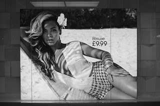 gaze in advertising
 gaze in advertising
 keep out
 intrigued passer
 women payed no attention to the box
 She stood right next to it for ages and then
finally stood in the box
 slows down to read
 acting up to the camera
 came to read the sign
 slowed down
 Girl and boy friend intrigued
 one of the only people to look in the box
 Young girls debated whether to look in the box
for a good minute or so
 young boy stops for a look
 young girl smiles the camera out
 girl poses for the camera
 this lad had a quick pose
 face pulling
 group of girls loved the bit of attention
 more posing
 ...
...
 couple posing
 woman testing retribution
 more...
 signage
 Camera
 Road markings on both sides
 Speedo
PHOTO SELECTION
I took frames from each of the videos and turned them into black and white photos in order to stick with the colour scheme and also reference a CCTV monitor. Here are a selcetion of possibilities


finally stood in the box


for a good minute or so


DESIGNING
After I had carried out my experiments It was time to right up my experiments. I started the book with an explanation of panoptocism which highlights the 3 panoptic techniques, with an explanation of what the tests were about and how they turned out. I used relevant quotes from my essay to explain aspects of the experiments.

I experimented with different page formats I decided the version on the left was more versatile and
allowed for more text. The black and yellow combo would be quite heavy on the eyes and quite dull.

The black and yellow colour scheme ran through out the publication.

I tried to use simple imagery on each page to visually represent
the experiment.

I decided to center justify my text in order to represent signage which
is generally in this format.
FONTS

I decided to Use arial Black and Arial Rounded MT as both these fonts are used on many
government signage around the UK, they have impact and work well together.

To improve the visual quality of the book I greyscaled all the images in order to fit in with the colour scheme. Coloured photos ruined the aesthetics.

I wrote a small section on the digital footprint in today's society highlighting some of the ways we are documented and registered online and elsewhere. It also touches on consumerism and personal online targeted adverts which are becoming ever more present in today's society.

I also looked at examples of adverts in the trinity center which women as an extension of the gaze. These large scale provocative images are all over the trinity center. This can have an affect on the way women feel about their bodies which can have a negative effect. It can also attract the attention of males who will be influenced to buy the items for the girlfriends etc, as it gives the impression that's how they will look if they wear it.

To break up the white space I drew simple illustrations which referenced the topic.
Now for Print...
No comments:
Post a Comment