Contrasts
During this session we looked at how colours work and how they work against other colours
During this session we looked at how colours work and how they work against other colours
- The Contrast of Tone - Formed by the juxtaposition of light and dark values. This could be monochromatic
- The Contrast of Hue - Formed by the juxtaposition of light and dark values. This could be monochromatic
- The Contrast of Saturation - Formed by the juxtaposition of light and dark values and their relative saturations
- The Contrast of Extension - Formed by assigning proportional field sizes in relation to the visual weight of a colour. Also known as the contrast of proportion.
- The Contrast of Temperature - Formed by juxtaposing hues that can be considered ‘warm’ or ‘cool’. Also known as the contrast of warm and cool
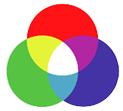
- Complementary Contrast - Formed by juxtaposing complementary colours from a colour wheel or perceptual opposites
- Simultaneous Contrast - Formed when boundaries between colours perceptually vibrate.


Contrast of Extension Simultaneous Contrast
Additive Color. If we are working on a computer, the colors we see on the screen are created with light using the additive color method. Additive color mixing begins with black and ends with white; as more color is added, the result is lighter and tends to white.
 The RGB colors are light primaries and colors are created with light.
 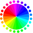 Percentages of red, green, & blue light are used to generate color on a computer screen.
Subtractive Color. When we mix colors using paint, or through the printing process, we are using the subtractive color method. Subtractive color mixing means that one begins with white and ends with black; as one adds color, the result gets darker and tends to black.
 The CMYK color system is the color system used for printing.
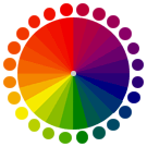 Those colors used in painting—an example of the subtractive color method.
Experimenting
We played about with our objects and different background colours to see what effect it had on the colours. Here are some photos of my experimentation.

This shows a contrast in tone and temperature and saturation, it takes away the brightness from the red pencil giving a more orange look.


Contrast in Tone and Temperature

Contrast in Hue

The Frisbee on the background is a contrast of Hue, its dull background makes the orange of the Frisbee really stand out.


This brings out the pink well


This shows a contrast in saturation and tone the bottle looks lighter

Here you can see a complementary contrast, both colours look quite vibrant


This shows a contrast in temperature the background brings out quite warm oranges in the bottle

These two images I think are a contrast with tone and also a complementary contrast. The paler yellow makes the bottle look less saturation than the brighter yellow.


The orange background really brings out the green on the object this is a contrast of complimentary colours here and also Hue.


Complementary Contrast

Here is a contrast in temperature and tone, the object looks less red against the paler red back ground

The red is allot stronger on the gray background the yellow makes the shoe look more orange, this could be a Contrast in temperature

Here I was testing to see how placing the objects against two contrast backgrounds would change the colour of the object.

The object stands out more against the green, where as the orange takes the colour away from the object

The red makes the object look more saturated.

The yellow makes the object more orange where as the grey brings out the red in the cup

The violet shows a complementary contrast with the object where as the yellow shows a contrast in temperature.

The lighter orange on the left makes the objects stand out more than on the right

Here is a nice contrast in temperature, the blue brings out the cooler colours on the bottle and the red brings out the warm

No comments:
Post a Comment