Brief
You have developed a message/opinion in response to the previous brief.
Produce a mail shot that distributes, disseminates and reinforces your message to an appropriate list of recipients. Your resolution should fit within the envelope provided* and be accompanied by a visually appropriate mailing list. You should consider the relation ship between the outside/inside of the envelope and its contents.
The tone (occupation selected from the randomiser) of voice should be appropriate to your message, the context in which it is intended to be read and the audience to whom your work will be delivered.
Background / Considerations
What do you want to say and how do you want to say it? What language would be appropriate?
What visual languages exist that relate to your message and how can you use them.
Is the content communicated primarily through type or image? If it is both what is the relationship between the two?
What does the mail shot aim to achieve. Does it direct you to a website, encourage you to attend an event, is it interactive or is it self-contained.
I was given the profession of a butcher, so initially I brainstormed things I associate with a butcher. There was all the common things like a cleaver, knives, meat etc...
From here I looked at how I could link my proverb, "Two wrongs don't make a right" I started to think about Fast food restaurants, and how the meat is horrible but its cheap, the food is terrible for you. I didn't think this was the right avenue to go down so I decided to concentrate on the topic of battery farming and how butchers meat is allot better for you and more ethical than battery farmed meat. I thought the proverb could be translated like this:
Two wrongs don't make a right :
Poor animal conditions + Poor Quality Meat = Just because its cheap doesn't make it right!
I researched into design work of a similar nature and aspects of design that I just like in particular. That could help influence my decisions on it.

Chicken Out Campaign
Here is a piece of design work for the Chicken Out Campaign, its eye catching and gets the message across well. They have used a simple colour scheme too which is always good for high impact .

The Gentle Barn
I like this simple silhouette illustration used here in the gentle barn logo, A farm promoting the well being of farm animals.
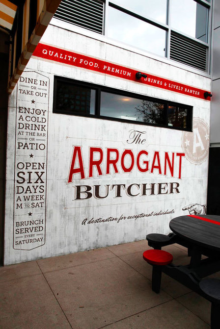
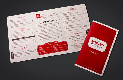
I came across the work of Tunnel Bravo online, he did the branding work for this Restaurant in Arizona USA, I really like the use of colour, he has stuck with red and white which is stereo typically associated with butchers, He uses a combination of sans serif, serif and script font which works well.
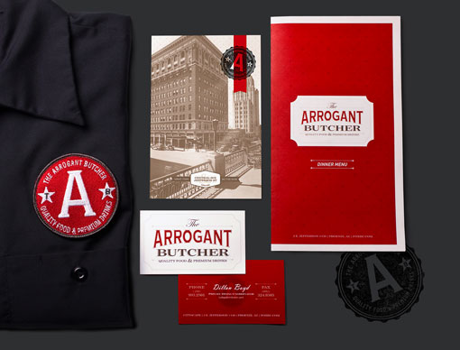
Here is some more branding work he has done, I thought it was relevant again as it displays farm yard animals. He has a nice illustration style and I really like the use of type.

North restaurant identity & design work


Louise Rouse


Here is a cever mailshot I found, I like the fact that the audience gets to engage with the mailshot, giving them the chance to build the house, I will look into doing this.
Emo Design
I Came across a website with a fair few mail shots that I like the look of. I could definitely take inspiration form these. Click here for Site
No comments:
Post a Comment