I have collected 5 examples of imagery, that is aesthetically pleasing to me.
Tang You Hang
This piece of work is very clever, I really like what he has done here. Its subtle which is an aspect of the design that I like, it took me a couple of seconds to realize there were houses in the top of the tree / roads. It has a nice colour scheme that is easy on the eyes. Overall a very nice bit of design.
Christoph Ruprecht
I like this abstract imagery Cristoph has created, It takes inspiration from an "afternoon by the pool" the colour scheme works well, he has used a nice contrast between vibrant and soft colours. The red stands out really well against the paler colours. I also like the curvaceous shapes used, it looks very natural.
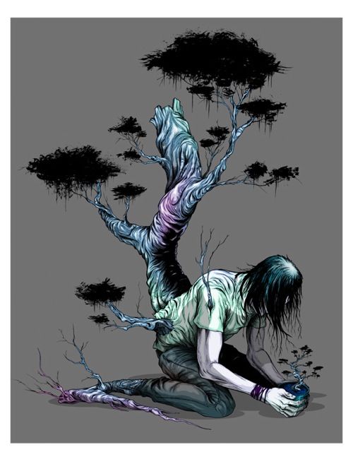
Alex Pardee
This is an Illustration I particularly like, its quite twisted which I like, he has used greens and purples in quite a subtle way which references a zombie like feel to the character, it works really well on the grey background. The character stands out which makes it eye catching.
Olly Moss
I really like this style of work, its simple but really interesting. He sticks to a simple eye catching colour scheme which works well with this kind of authentic old style he has. I really like its print based qualities. This image within an image style works great.
Damon Soule
This is a masterpiece, I really like that there is so much going on, everywhere you look there is something going on. He uses geometric shapes in his work and this works well with this composition. He takes allot of his inspiration from the solar system.
What I look for Aesthetically in Design
What I look for Aesthetically in Design
- Is the work Unique?
- Playful?
- Interesting Layout
- Good use of Colour
- How Clever is the piece of design? - Does it need a second look?
- Go Skiing
- Experience a tropical Rainstorm
- Bake an Exquisite Cake
- Taste some Real Cream Brule
- Try get hold of some Ice tea


No comments:
Post a Comment